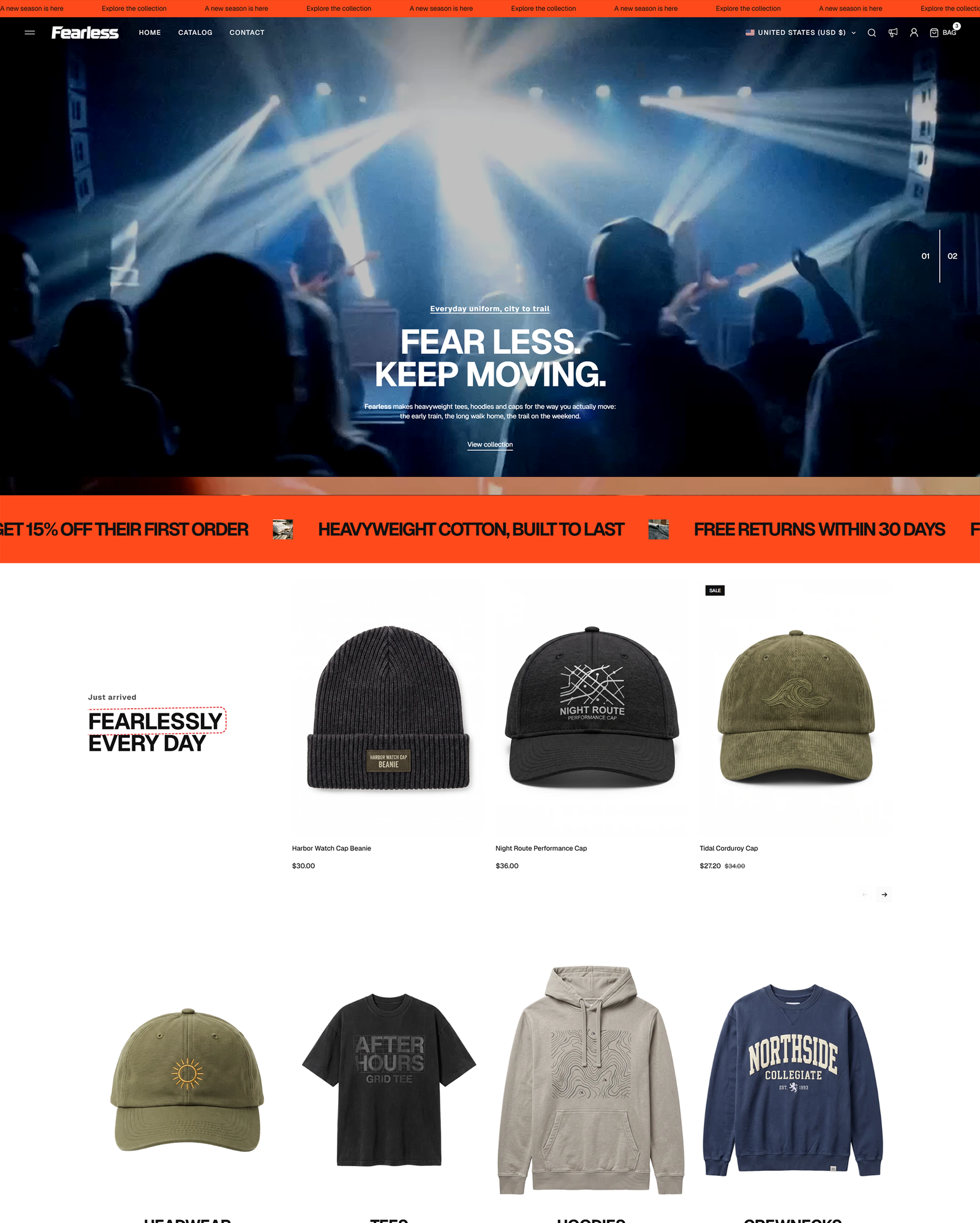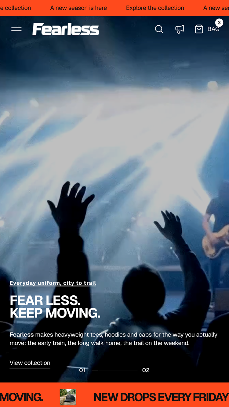

Fearless
clothing

Fearless

Shopify theme by Axiom Themes

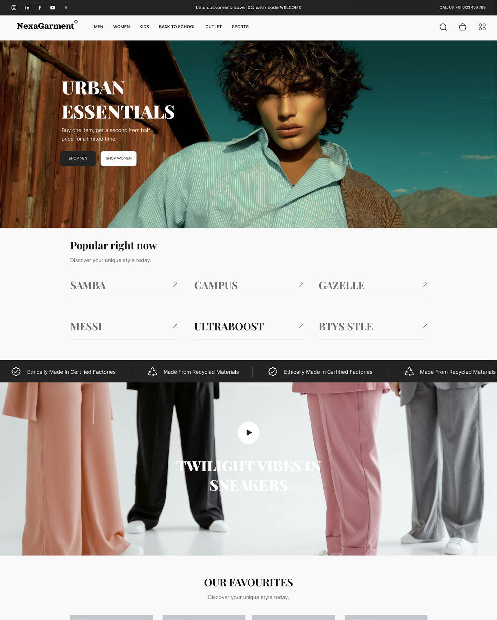
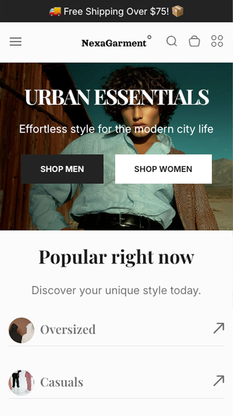
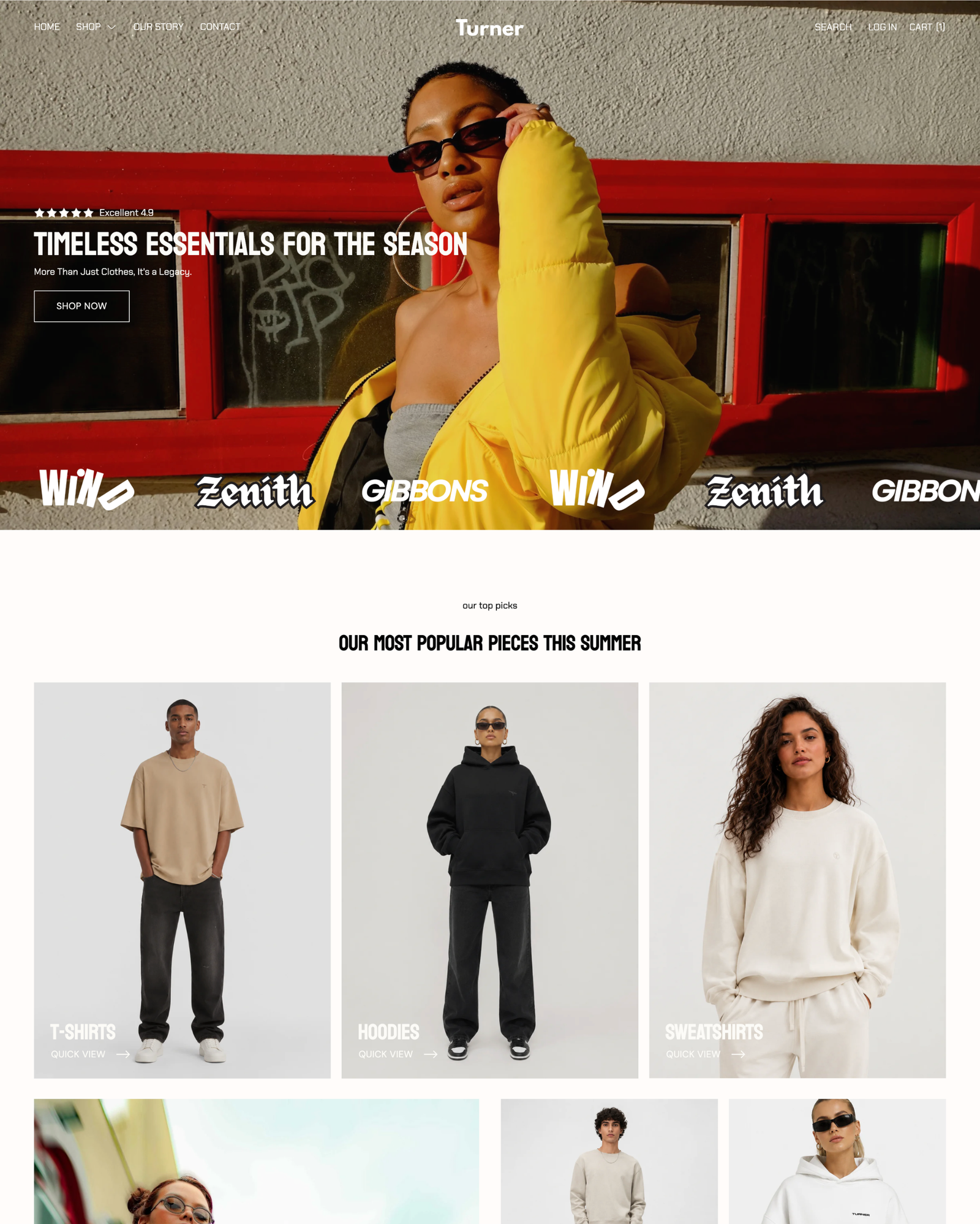
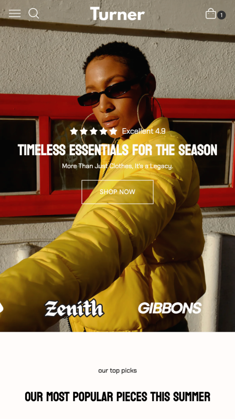
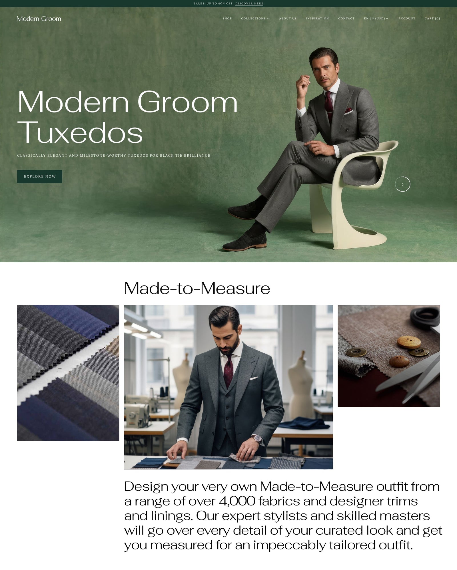
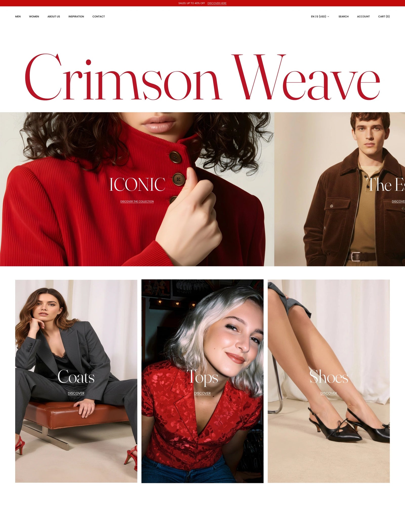
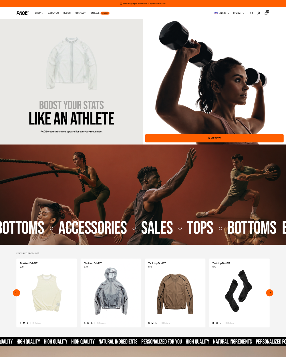
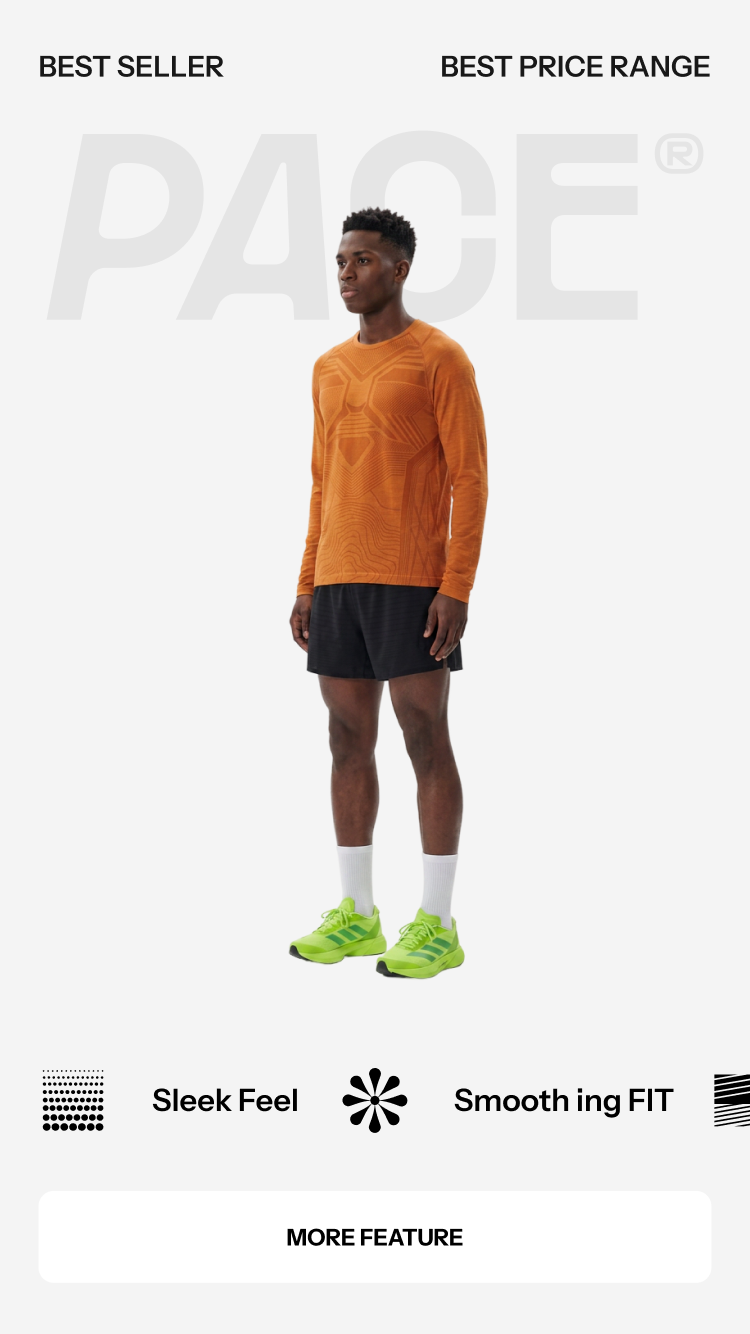
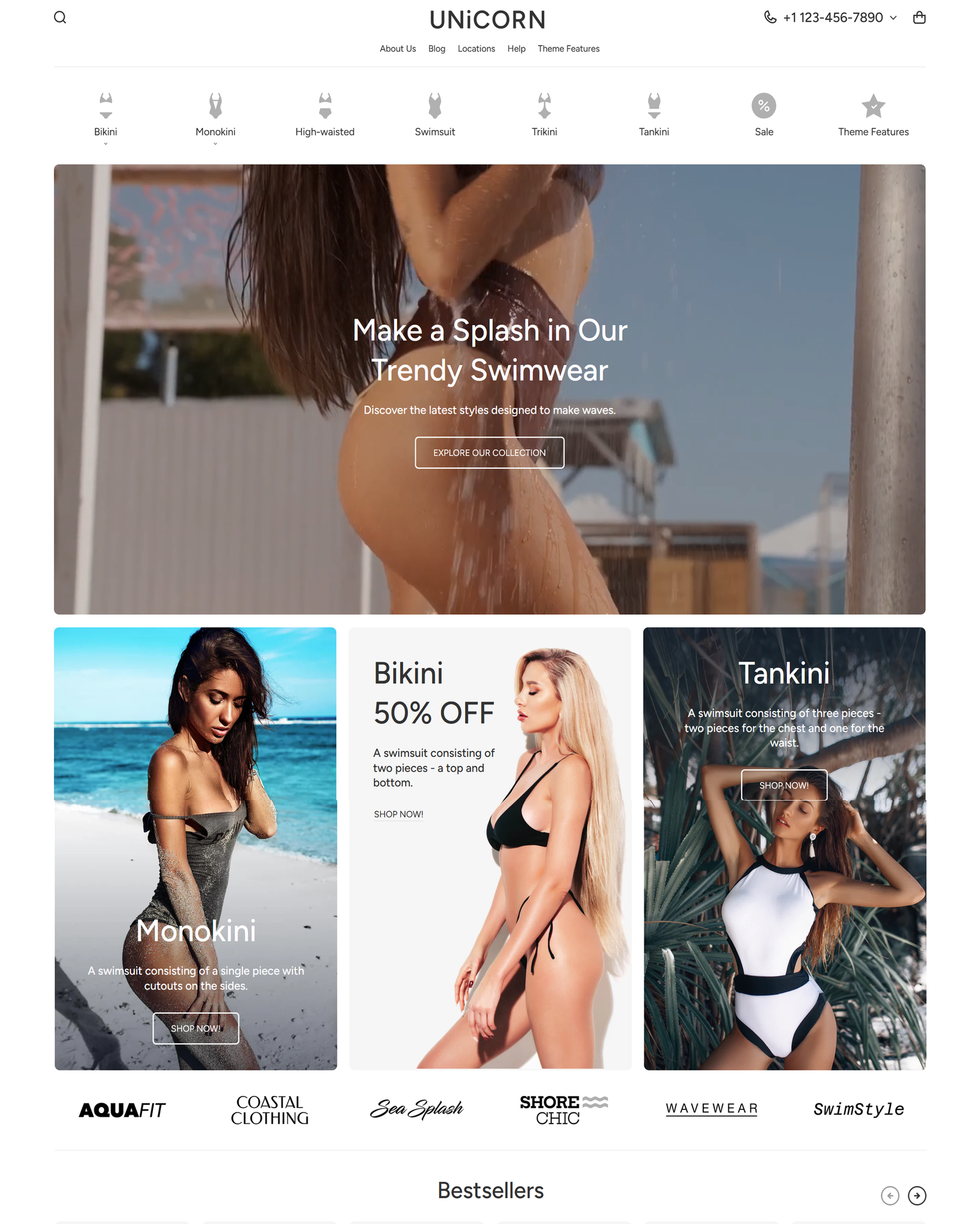
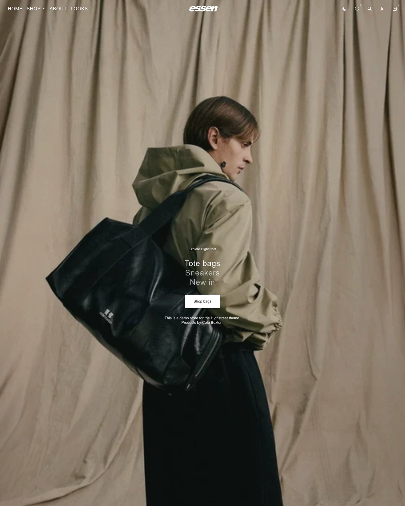
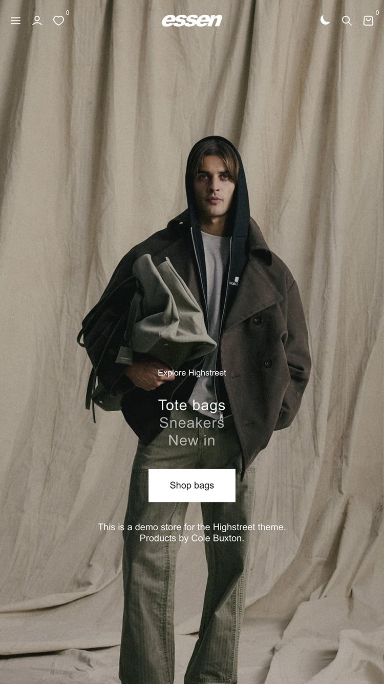
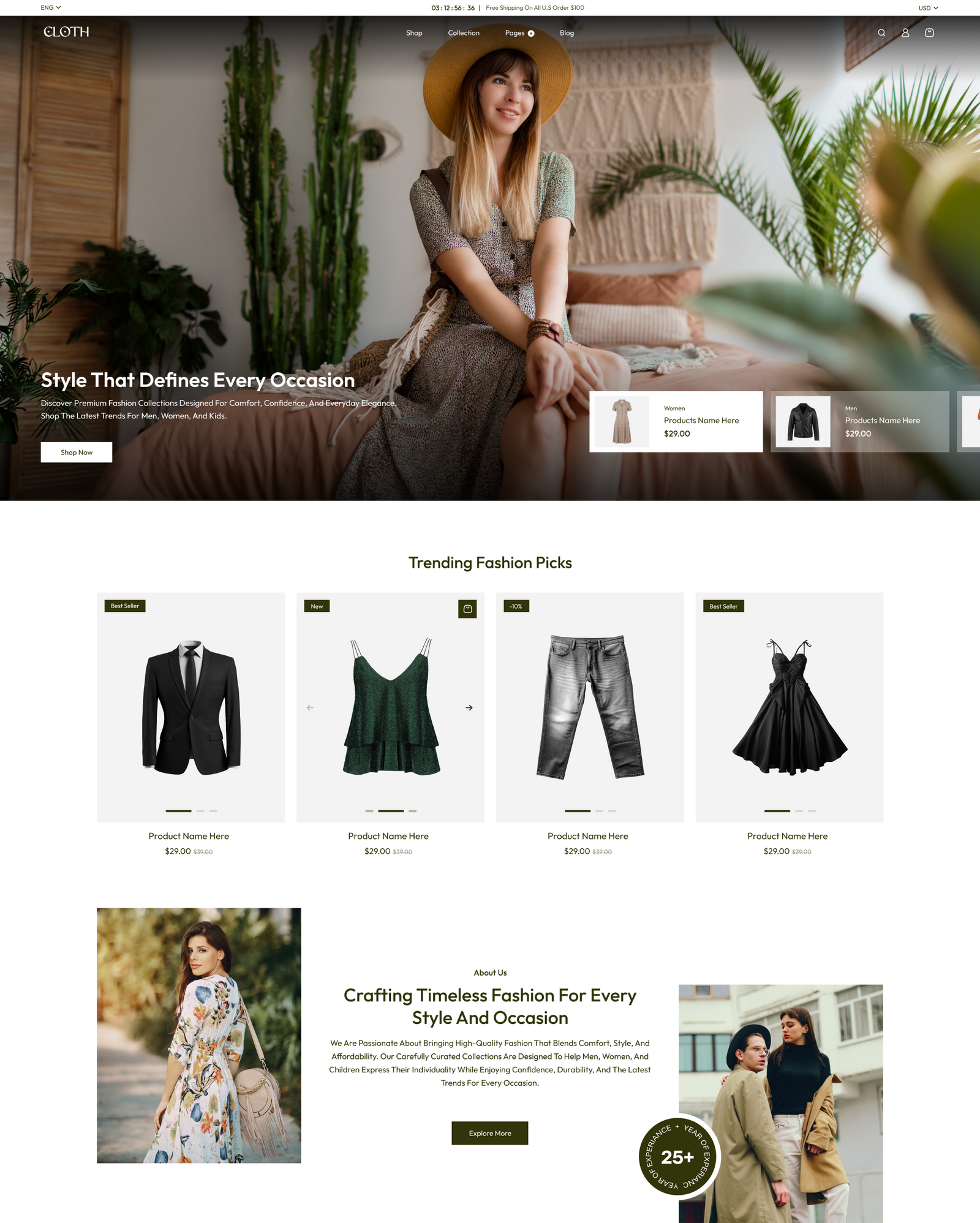
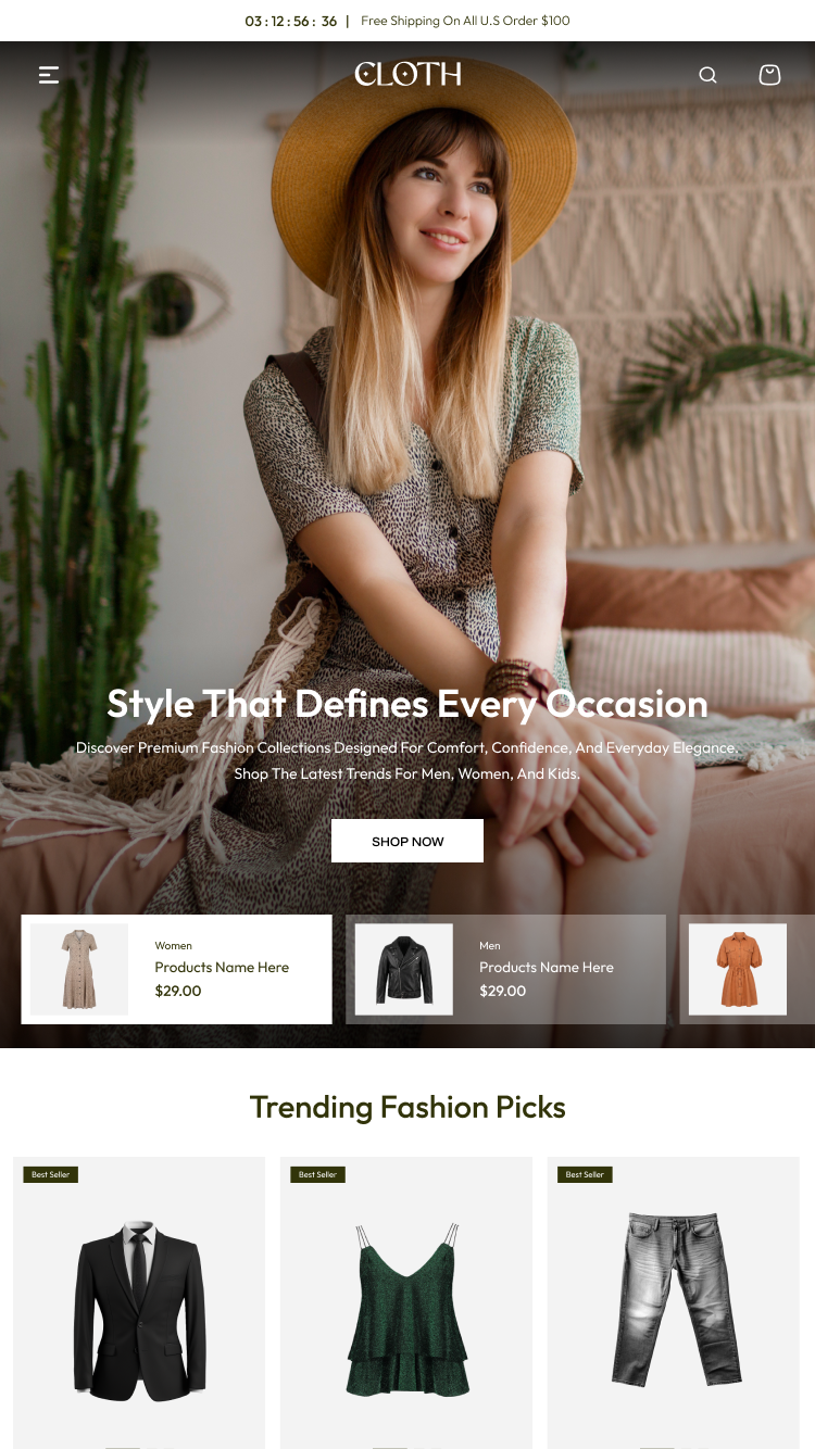
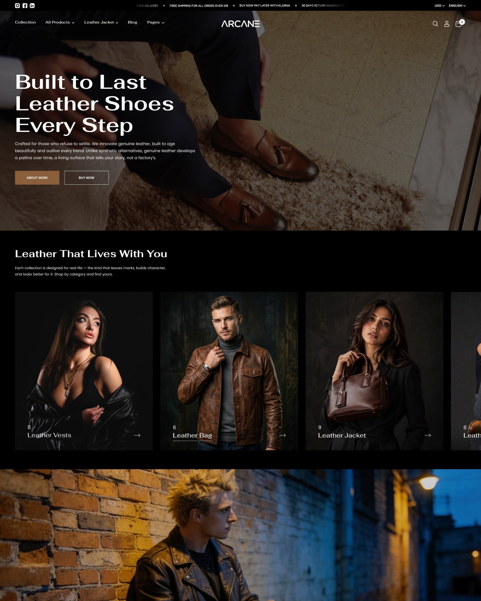
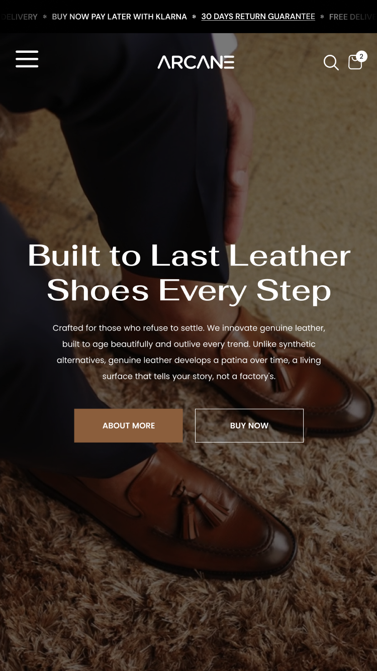
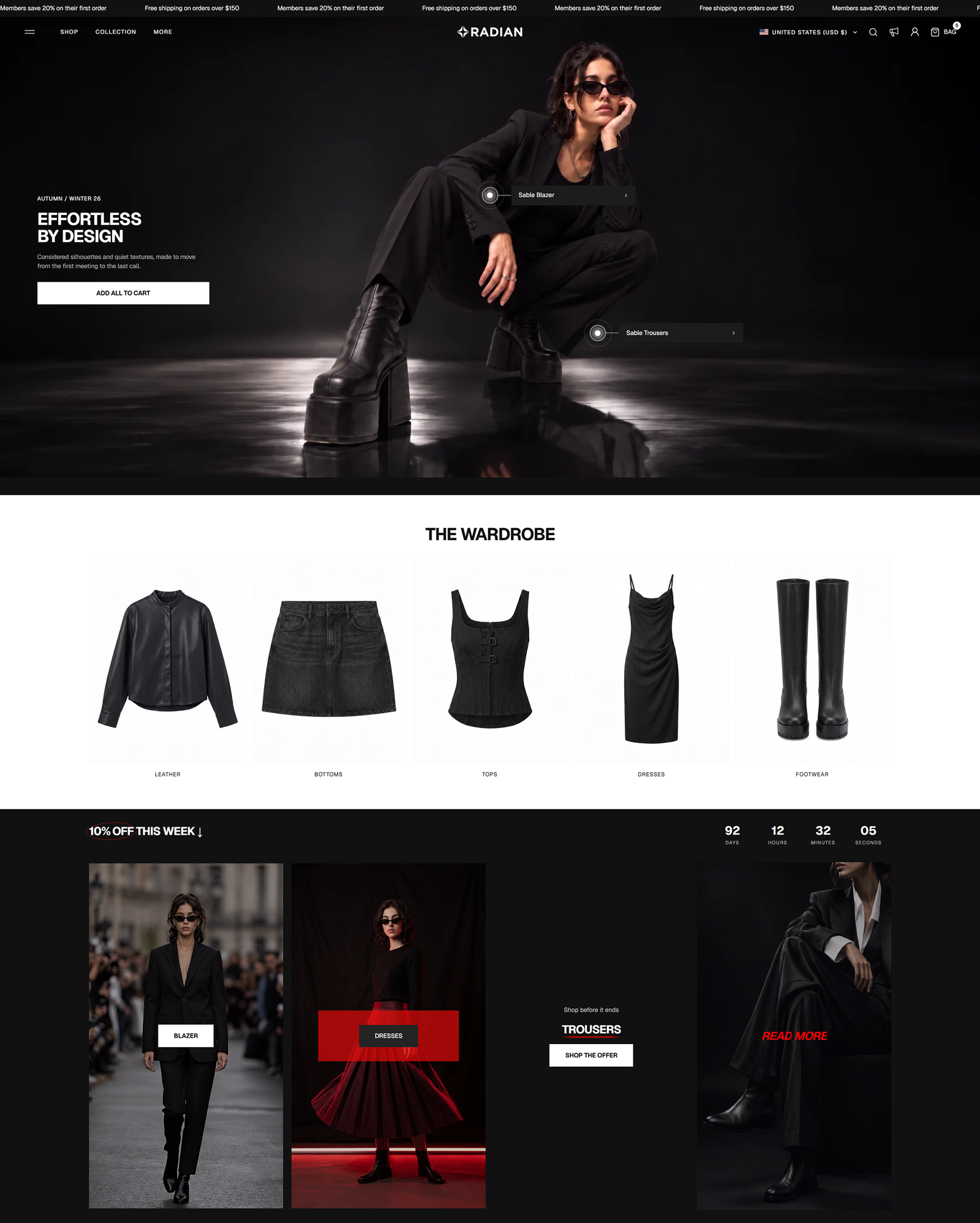
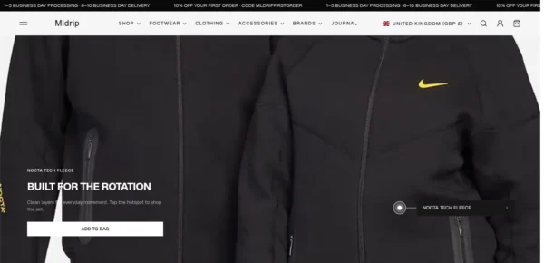
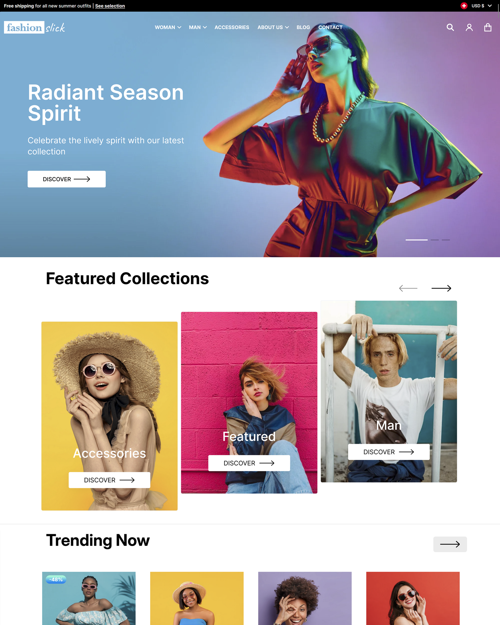
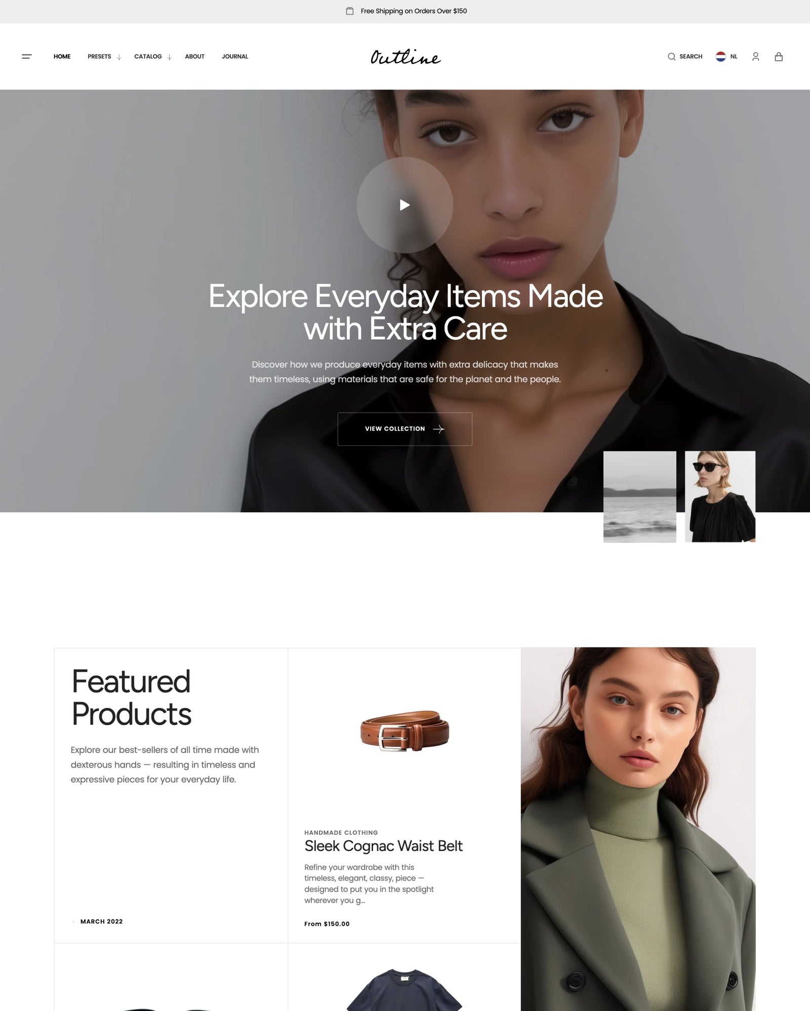
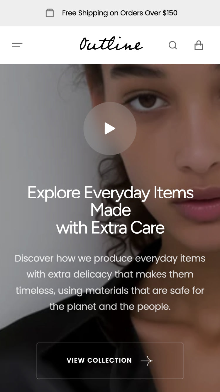
A mobile-first, high-end look defines Radian, a Shopify theme built for fashion and clothing storefronts with an emphasis on detailed product visualization. Image hotspots, before/after sliders, and high-resolution galleries sit alongside a slide-out cart, quick buy, and quick view, with mega menus and lookbooks for larger collections.
Source Shopify Theme Store Official
★★★★★
★★★★★
0.0 · 0 reviews
PRICE
$ 290,00 USD
PRESETS
2 styles
PRESETS INCLUDED Total 2

Independently reviewed by the eDIY editorial team

Fearless ranking and satisfaction

Position among all Shopify themes
#1147 of 1299
Position among Shopify themes for "clothing"
#4 of 264

Tracked over time

Shopify themes ranking

Position among all Shopify themes

#1147
95 positions
Sep 30 Oct 1 Oct 2 Oct 3 Oct 4 Oct 5
improved from #1242 to #1147 since Sep 30, 2026

Industry ranking

Position among Clothing industry

#4
position
Sep 30 Oct 1 Oct 2 Oct 3 Oct 4 Oct 5
No ranking change since Sep 30, 2026

Review growth

Cumulative merchant reviews

0
reviews
Sep 30 Oct 1 Oct 2 Oct 3 Oct 4 Oct 5
No new reviews since Sep 30, 2026

Price history

Theme Store list price, USD

$290
no price changes
Sep 30 Oct 1 Oct 2 Oct 3 Oct 4 Oct 5
No price changes since Sep 30, 2026

Stores using Fearless

1+ live storefronts detected · showing 1

Release history

LATEST VERSION
v3.0.0
Released September 29, 2026
Releases in 12 mo 4
Total releases 4
First release September 14, 2026
v3.0.0 MAJOR

Adds new bundle-building and immersive merchandising sections, expands responsive design controls, and improves product discovery, variants, overlays, and mobile storefront interactions.

Added

  • Added Bundle multiple select, allowing customers to build a bundle from a collection or manual product list, select variants, track up to three quantity-based savings tiers, and add the selected products together through Shopify's Ajax Cart. Matching automatic discounts are configured in Shopify Admin.
  • Added responsive Bundle multiple select controls for product limits, columns, card appearance, selection animation, tier progress, desktop sticky summary, and an expandable mobile summary with remaining skeleton slots.
  • Added Category Showcase with sticky category navigation, linked image or Shopify-hosted video cards, optional content backgrounds and promotions, and independent Wipe, Stacked overlap, or Normal scroll styles for desktop and mobile.
  • Added Banner Sticky Scrolling with full-width image or Shopify-hosted video banners, centered sticky category navigation, optional nested product cards, per-product positioning, and Wipe, Stacked overlap, or Normal scroll styles.
  • Added Footer bottom panel for localization, country selection, policy links, payment icons, and copyright content, with responsive columns and rounded presentation options.
  • Added a Split intro block to Blog posts, allowing the Split layout to replace the featured article with customizable subheading, heading, description, button, alignment, and content-width controls.
  • Added an optional Content info card to Featured collection so section content can scroll as a card alongside products in the horizontal layout.
  • Added a Countdown block to Image banner.
  • Added an optional floating tab to Flyout, with label, color, typography, width, side, vertical position, orientation, and dismiss controls.
  • Added Flyout media placement, sizing, ratio, spacing, corner radius, staged panel/media transitions, background blur, and scroll locking.
  • Added a global Heading reveal animation for supported section and block headings.
  • Added a global animated close cursor when the pointer moves outside supported drawers and pop-ups.
  • Added a Media gallery hover effect to Product cards, including configurable indicator thickness and background.
  • Added global variant controls for picker size, non-swatch shape and corner radius, swatch corner radius, active border thickness and padding, and optional cursor-follow movement.
  • Added an independent Product card variant option size, including Extra small and Extra large choices.
  • Added full presentation controls for the Scroll to top button, including desktop/mobile placement, shape, size, radius, border, colors, offsets, threshold, shadow, and animation.
  • Added Price inline with product title and two Saving price styles to Product, Featured product, and Quick view.
  • Added two floating Sticky add to cart content layouts on Product pages.
  • Added optional 75% mobile media width for horizontal Product, Featured product, and Quick view galleries.
  • Added Parallax scroll behavior to Marquee so scrolling drives the marquee while the section is in motion and automatic movement resumes afterward.
  • Added Columns occupied and Make full columns controls to supported Footer blocks.
  • Added Block alignment, background-follow-layout, section/content padding, and independent section-corner controls to Grid.
  • Added separate desktop and mobile controls for content position, alignment, heading scale, maximum content width, media fit, media ratio, gaps, and padding across supported sections and blocks.
  • Added responsive content-padding controls.
  • Added independent Desktop columns and Mobile columns controls to Multi-column, with automatic row wrapping and a contained mobile slider option.
  • Added per-block Media ratio controls to Multi-column Media and Collection blocks.
  • Added a Show product count option to Multi-column Collection blocks.
  • Added native Product cards to Multi-column Products blocks, with global Product card settings or a complete set of local card controls.
  • Added optional global or local Product card controls to Related products and Recently viewed products.
  • Added a consistent Show scroll progress control to supported horizontal product, collection, media, and content rails.
  • Added mobile pagination style, position, and width controls to Slideshow.
  • Added a configurable underline thickness to Slideshow subheadings.
  • Added independent desktop and mobile Quote alignment plus Quote maximum content width to Testimonials.
  • Added Header control for showing or hiding dropdown icons in the main menu.
  • Added up to four optional custom product-tag filter groups for Collection and Search pages, each with its own title, tag list, and checkbox or button layout.
  • Added filter typography and uppercase controls to global filter settings and local Collection/Search filter settings.
  • Added configurable 2–4 column mobile Predictive Search results, Collection suggestions, and independent Product/Collection title visibility controls.
  • Added global Upsell controls for Button text or Plus icon Quick buy styles, left/center/right button positioning, three additional compact button sizes, corner radius, icon background color, additional media ratios, and scroll progress.
  • Added optional Direct buy behavior for Upsell products, including add animation and a Cart-only mode.
  • Added cursor-position image zoom to the Product media lightbox, with an adjustable zoom scale up to 500%.
  • Added Sticky thumbnails to the Product media 1 Full / 2 Split layout.
  • Added Drawer media ratio options to Hero product hotspots.
  • Added an independent mobile color scheme to Hero product hotspots.
  • Added an independent mobile heading color override to Hero product hotspots.
  • Added expanded Contact form presentation controls for form layout, column ratio, width, background, foreground, corner radius, field style, label position, fields per row, gaps, padding, phone visibility, and button presentation.

Changed

  • Reorganized responsive settings into consistent Desktop and Mobile groups.
  • Reorganized Theme settings into clearer typography, product card, variants and swatches, drawers and pop-ups, animation, filter, and utility groups.
  • Consolidated overlapping swatch and non-swatch variant settings while preserving independent shapes and corner radii for each presentation.
  • Updated Bundle multiple select cards to inherit global Product card and variant settings by default, with focused local overrides when global settings are disabled.
  • Updated Product card media galleries and Bundle multiple select to share the same three-image hover interaction and indicator treatment.
  • Updated Flyout so its panel opens first and media reveals outward from the selected top, right, bottom, or left position without changing the configured panel size.
  • Updated Upsell layouts across Product, Featured product, Quick view, and Cart drawer with smaller media, vertically centered product information, heading-level navigation controls, and a compact Panel tab action.
  • Moved localization, payment icons, policy links, and copyright content into the dedicated Footer bottom panel.
  • Updated Product sticky add to cart to use a floating panel consistently, with two selectable internal content layouts.
  • Updated Multi-column so adding blocks no longer continuously shrinks every column; items now follow the selected column count and wrap onto additional rows.
  • Updated Product card settings in Related products and Recently viewed so global settings are inherited consistently and local overrides remain available when global settings are disabled.
  • Updated Contact form background and padding so they apply to the form container rather than the entire section.
  • Updated Hero product hotspots media to respect Shopify image focal points and maintain more predictable cropping as the viewport changes.
  • Updated Discovery block assignment labels from Content group to Assign to tab.

Fixes and other improvements

  • Fixed responsive content positioning and alignment inconsistencies across Image banner, Slideshow, Video, Image with text, Split media, Shop the look, Testimonials, Hero product hotspots, and other supported content sections.
  • Fixed large mobile headings being clipped despite remaining inside the viewport, including uneven left and right gutters in Image banner.
  • Fixed mobile media sizing, cropping, and page-level overflow caused by content or horizontal rails exceeding their containers.
  • Fixed Slideshow mobile pagination sizing and placement so counters and controls remain proportionate on small screens.
  • Fixed Hero product hotspots media exposing the section background when the browser width changed and reduced unintended image scaling across wide viewports.
  • Fixed Hero product hotspots drawer media appearing too narrow and added configurable media ratios.
  • Fixed Product 1 Full / 2 Split thumbnail rails so Inside and Outside placements can remain sticky, scroll independently, and keep the active thumbnail visible while the main media changes.
  • Fixed Quick view Slideshow galleries with many thumbnails so the main media remains sticky while the thumbnail rail scrolls independently.
  • Fixed variant-image swatches in Product, Featured Product, and Quick view so their images update to match the currently selected Color, Size, Type, and other option values, including products with more than 250 variants.
  • Fixed variant images sitting too close to their inactive borders and aligned active borders consistently across swatches and other variant options.
  • Fixed Bundle multiple select summary scrolling, skeleton replacement, mobile expansion height, total/button alignment, and disabled/enabled Add bundle to cart states.
  • Fixed Grid media blocks being stretched by the section height when a fixed media ratio is selected, and preserved two-column mobile layouts when block order is reversed.
  • Fixed Featured collection full-width product cards so titles and prices retain safe horizontal gutters.
  • Fixed Testimonials Image breaks cards so Quote content remains visible when an image is assigned.
  • Fixed product pricing updates across Product, Featured product, and Quick view so inline and stacked saving styles remain correct after variant changes.
  • Improved filter consistency between global and section-level settings, including custom tag groups in drawer, sidebar, dropdown, and toolbar presentations.
v2.0.1 FIX

This maintenance update fixes a purchase issue affecting products with more than 250 variants. Shoppers can now select available options and add the correct variant to their cart across product pages, Quick view, and Featured product.

Fixes and other improvements

  • Important: Fixed available variants incorrectly appearing unavailable on products with more than 250 variants, which could prevent shoppers from completing a purchase.
  • Improved inventory notices and cart quantity controls so shoppers see accurate stock limits when adding or updating items.
v2.0.0 MAJOR

This update optimizes mobile performance and adds more ways to customize your storefront. It introduces a shoppable Discovery drawer, new promotional sections, and expanded product customization. Header layout is now easier to configure, and slideshow, cart, and product-page behavior are more consistent across devices.
Added

  • Added a Discovery drawer section with tabbed content for media, products, offers, stories, countdown, newsletter, and custom Liquid.
  • Added a Social grid section for image and looping-video tiles, with background media, overlay, column, and heading controls.
  • Added a Promotion section for stacked promotional text.
  • Added a Free shipping bar block to Product, Featured product, and Quick view, with a shared spending threshold
  • Added custom product option blocks for date, single-line text, multi-line text, checkbox, pills, dropdown, and file upload on Product, Featured product, and Quick view.
  • Added Collapsible tab, Collapsible description, and Pop-up blocks for product details.
  • Added a store-wide Size guide page setting. A product metafield can still override the page for an individual product.
  • Added typography controls for primary and secondary buttons.
  • Added add-to-cart image animation and additional Add to cart animation styles.
  • Added overlay, shadow, and blur controls for drawers and pop-ups.
  • Added an option to open selected links in a new tab.
  • Added additional overlay content blocks for Image banner, Video, and Fullscreen media product.
  • Added Header burger menu controls for two or three icon lines, three hover animations, and an optional Highlight sweep.
  • Added Menu drawer controls for configuring Menu panel Child menu columns independently on desktop and mobile, plus Child menu alignment. Menu panels can display collection images.
  • Added Image gallery Mobile Style options: Horizontal scroll with image-size scaling, Mosaic with rotating images and optional in-image headings, and Stacked with configurable columns.
  • Added Mobile layout controls to Product, Featured product, and Quick view media blocks: Horizontal scroll, Hide thumbnails, Show scroll progress, and Full-width media.
  • Added multi-container content layouts to Product and Featured product. Use the Second container block to split detail blocks, then choose two content columns, a second container below media, or media between the two containers. Full-width layouts also support content padding.
  • Added a Hide on mobile option to the Grid section.
  • Added global close-button animation and border controls under Theme settings > Extras for overlay close buttons.
  • Added a Text tab style for Collection Tab, including optional independent typography for active and inactive tabs or inheritance from each Category block heading.
  • Added Mobile Quick view behavior controls for product cards: always show the button, open Quick view on card tap, or reveal the button on first tap.
  • Added a dedicated Quick view Add to cart style under Product buy buttons.
  • Added a Make font bolder control to heading-capable section and block settings.
  • Added a mobile post-collapse option to Blog posts, with configurable Show more button style and position.
  • Added a standalone Fade option to Sticky overlap animation across supported sections.

Changed

  • Important: Combined desktop Header logo and menu placement into a single Header layout setting. Merchants using the previous logo position and menu alignment settings should review their Header after updating.
  • Important: Moved the store logo from Theme settings into the Header. Review the Header logo block after updating.
  • Improved Slideshow content position, alignment, overlay, and progress behavior so media and text stay correctly placed.
  • Moved the cart drawer item count next to the drawer title.
  • Updated size charts so one default page can apply to all products unless a product has its own guide.
  • Improved Image with text so text alignment changes the text only, while section alignment moves the content group.
  • Limited the Add to cart fill animation setting to outline-style buttons so it no longer duplicates filled button styles.
  • Updated the Icons row compact grid option to Stacked.
  • Expanded heading, subheading, and text style options in the Discovery drawer.
  • Refined Sticky overlap Fade and Fade + Scale motion so the fade remains perceptible throughout the overlap transition.

Removed

  • Important: Removed the Information block from Product, Featured product, and Quick view. Use Collapsible tab, Collapsible description, or Pop-up instead.

Fixes and other improvements

  • Fixed Slideshow overlays covering slide media when a color scheme was applied.
  • Fixed Image with text content remaining stuck to the left when horizontal alignment was changed.
  • Fixed the mobile cart drawer height so browser controls no longer hide bottom actions such as Remove all, and increased spacing above the free shipping bar.
  • Fixed the mobile sticky Add to cart bar appearing immediately at the top of product pages. Added a Mobile Sticky ATC On Top setting for merchants who prefer the previous always-available behavior.
  • Fixed Hero product hotspots so Center heading on image keeps the heading centered regardless of desktop or mobile content alignment.
  • Fixed Collection banner Heading position on mobile so Left, Center, and Right move the heading as selected.
  • Improved mobile image loading by prioritizing lazy-loaded media before it reaches the viewport, reducing delayed image rendering while scrolling on Safari.
v1.0.0 MAJOR

Alternatives to Fearless for Clothing industry