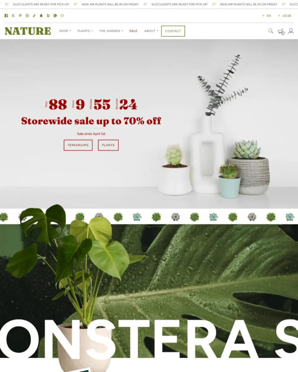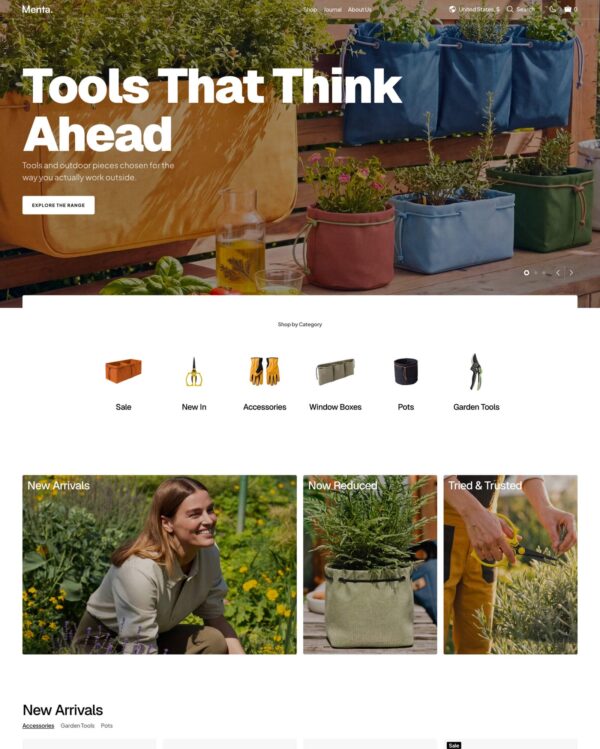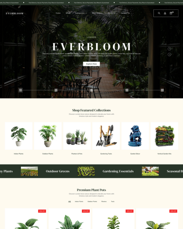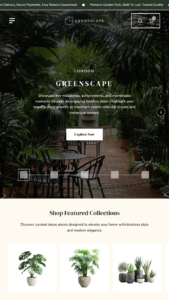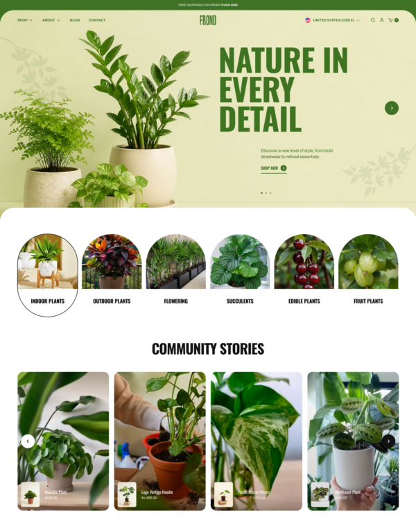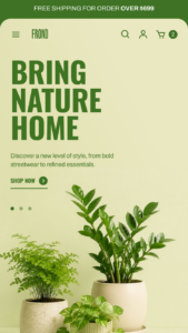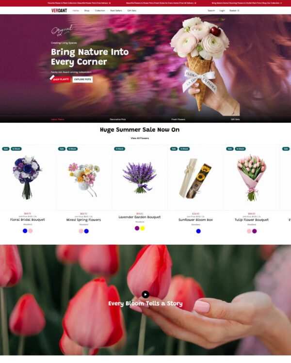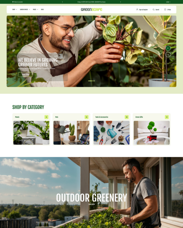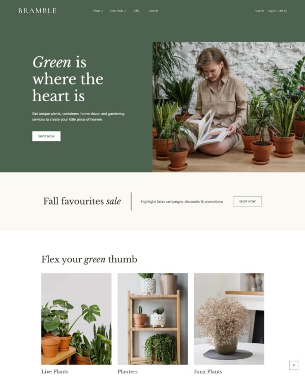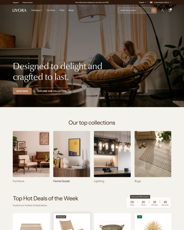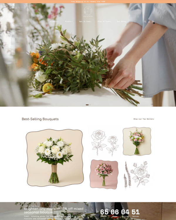
Peace
garden

Peace

Shopify theme by RoarTheme

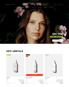
Be Yours is a refined Shopify theme built for skincare, fragrance, and beauty brands, leaning on editorial storytelling rather than a purely catalog-driven layout. Notable tools include ingredient tabs, scent notes, ritual steps, shoppable image hotspots, before/after sliders, a sticky cart, and quick buy.
Source Shopify Theme Store Official
★★★★★
★★★★★
4.9 · 692 reviews · 98% positive
PRICE
$ 350,00 USD
PRESETS
4 styles
PRESETS INCLUDED Total 4

Independently reviewed by the eDIY editorial team

How fast is Peace?

Google PageSpeed Insights scores for the home page, out of 100

In our October 2026 test, the official Peace demo scored 60/100 on mobile and 97/100 on desktop. Mobile LCP was 7.6s, CLS was 0.00, and Total Blocking Time was 383ms.

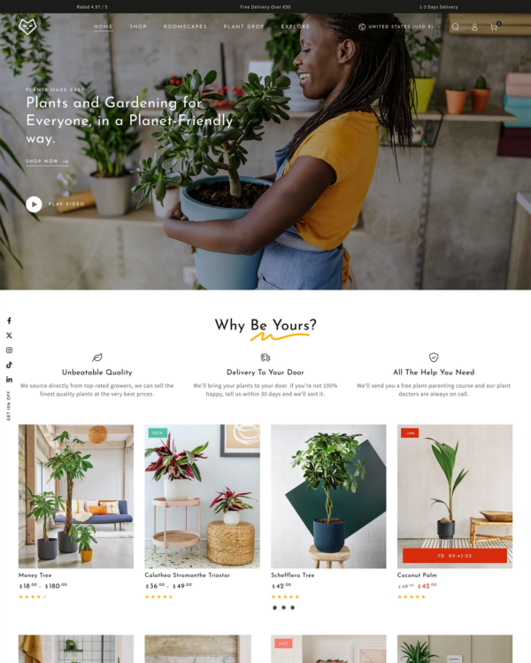
Theme demo store

Official Peace demo, home page
60 /100
Mobile
Needs improvement
97 /100
Desktop
Good

Tested Oct 2026 · Google PageSpeed Insights lab data

MetricMobileDesktop
Largest Contentful Paint 7.6s 1.0s
Cumulative Layout Shift 0.00 0.04
Total Blocking Time 383ms 31ms
Speed Index 5.0s 1.4s

Across 8 live stores we tested, the average PageSpeed score was 43/100 on mobile and 55/100 on desktop. Average mobile LCP was 15.5s and CLS was 0.12. These are complete production stores, so the numbers cover more than the theme itself.

Live stores average

Mean across 8 stores running Peace
43 /100
Mobile
Poor
55 /100
Desktop
Needs improvement

Tested Oct 2026 · Results include each store's apps, images, tracking scripts and customizations

MetricMobileDesktop
Largest Contentful Paint 15.5s 2.4s
Cumulative Layout Shift 0.12 0.26
Total Blocking Time 716ms 491ms
Speed Index 11.9s 3.4s

Per-store results

8 live stores · tested Oct 2026
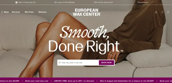
European Wax Center
waxcenter.com
Mobile 27
Desktop 58
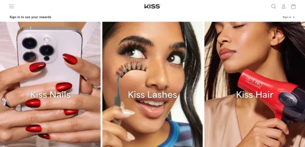
KISS USA
kissusa.com
Mobile 47
Desktop 44
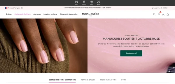
Manucurist
manucurist.com
Mobile 27
Desktop 59
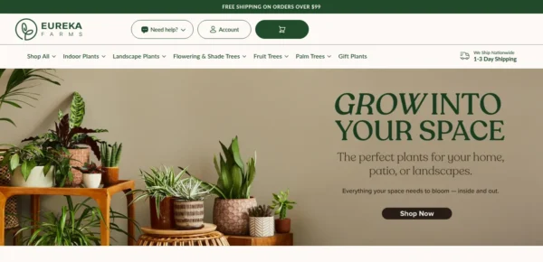
Eureka Farms
eureka-farms.com
Mobile 57
Desktop 81
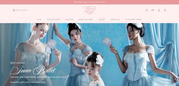
Flower Knows
flowerknows.co
Mobile 50
Desktop 28
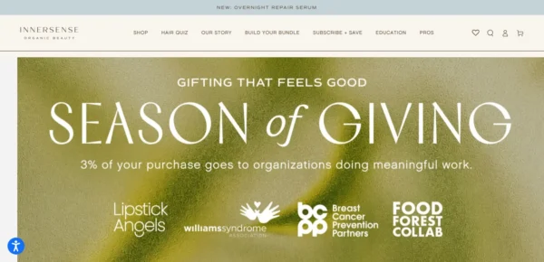
Innersense Organic Beauty Inc
innersensebeauty.com
Mobile 12
Desktop 34
Impressbeauty
impressbeauty.com
Mobile 61
Desktop 67
Gurunanda
gurunanda.com
Mobile 61
Desktop 67

Peace ranking and satisfaction

Position among all Shopify themes
#280 of 1308
Position among Shopify themes for "garden"
#4 of 29
Overall satisfaction based on all reviews
98% positive

Tracked over time

Shopify themes ranking

Position among all Shopify themes

#280
176 positions
Sep 11 Sep 27 Sep 30 Oct 2 Oct 5 Oct 8
improved from #456 to #280 since Sep 11, 2026

Industry ranking

Position among Garden industry

#4
2 positions
Sep 11 Sep 27 Sep 30 Oct 2 Oct 5 Oct 8
improved from #6 to #4 since Sep 11, 2026

Review growth

Cumulative merchant reviews

692
7 reviews
Sep 11 Sep 27 Sep 30 Oct 2 Oct 5 Oct 8
+7 new reviews since Sep 11, 2026

Price history

Theme Store list price, USD

$350
no price changes
Sep 11 Sep 27 Sep 30 Oct 2 Oct 5 Oct 8
No price changes since Sep 11, 2026

Release history

LATEST VERSION
v9.5.1
Released September 17, 2026
Releases in 12 mo 11
Total releases 71
First release February 11, 2022
v9.5.1 FIX

Be Yours 9.5.1 is a small, urgent follow-up to 9.5.0: it puts the phone header back in order and teaches the sticky cart to count every buy button.

Fixes

  • Fixed the phone header icons collapsing to the left after 9.5.0 — menu, search, bell and cart packed together at the left edge, and the cart could disappear underneath the centred logo. The header reads as designed again: menu and search on the left, the logo holding the centre, bell and cart on the right.
  • Fixed the sticky cart bar appearing while Buy It Now was still on screen — with "Show while buy buttons are off-screen" enabled, the bar watched only the add-to-cart button and stepped in too early. It now waits until the whole buy-button block has scrolled away.
v9.5.0 FEATURE

Be Yours 9.5.0 puts the first screen to work — buy buttons above the story on desktop, a sticky bar that greets shoppers on the phone — teaches search engines to index your videos, learns right-to-left languages, and closes a round of fixes from the field.

Added

  • Video SEO: every product video and video section now publishes VideoObject structured data, so search engines can index and surface your clips. A video needs a thumbnail to qualify — YouTube brings its own, Vimeo and hosted videos use your cover image.
  • Sticky Cart Follow: a new switch on the product page's sticky cart shows the bar whenever the buy buttons are off screen — from the moment the page opens, not only after scrolling past them. Off by default.
  • Automatic Right-to-Left: a Layout setting flips the storefront automatically when the language is Arabic, Hebrew, Persian, Urdu or another right-to-left script. Off by default; the text_direction_trigger translation keeps working and always wins when it says rtl.
  • Heading Tracking control: choose whether capitalized headings spread with wide display tracking or sit as plain labels. Existing stores keep the spread they have.
  • Storytelling templates: fresh installs open on a product page that tells a story — specs after the price, a scroll-spy chapter nav, ingredient story, before-and-after, a first-30-days timeline, shoppable video and FAQ — with a collection page to match. Your existing templates stay untouched when you update.

Improved & Optimized

  • The product page leads with the sale: buy buttons and stock status sit directly under the variant picker, the description and tabs follow, and on phones a square gallery with a slide counter brings title and price onto the first screen. New installs and the demo carry this order; your templates stay as you arranged them.
  • The demo homepage gains a layered community collage — four photos fanned behind a headline — in place of the single image banner.
  • Recent sections now mirror cleanly on right-to-left storefronts: video overlays and badges, the similar-products buttons, scroll-spy marks and progress, and the color fan's header all follow the reading direction.
  • The acid identity reaches every default: newly added sections, the editor's color schemes and the Be Yours style preset now start in white, black and lime. Anything you have already configured keeps its colors.
  • The scroll-spy chapter nav marks the active chapter in ink instead of the highlight color.
  • The sub-collections rail keeps to a single line in landscape orientation.

Fixes

  • Fixed sold-out variants losing their swatch image — a sold-out shade keeps its photo, its link and its quick-buy target on product cards and pickers.
  • Fixed the mobile logo drifting off centre when the header sidebar is turned off — the logo now holds the middle at any icon count.
  • Fixed small headings and prices rendering bold when the heading font loads without a regular cut — a 400-weight request now means 400.
  • Fixed the Dual Scroll text panel being crushed against the media column on wide monitors.
  • Fixed the similar-products button flashing full-size before its styles load.
  • Fixed countdown timers and product spec values scrambling their reading order on right-to-left storefronts — a timer reads like a clock in every script.
v9.4.0 FEATURE

Be Yours 9.4.0 steps into a new signature look — white, black and acid lime — and sharpens your merchandising tools: badges that take shape and tilt, product specs in five layouts, a richer icon vocabulary, and a round of fixes from the field across the cart, the quiz and the blog.

Added

  • A new default look: the theme's signature style moves from champagne to white and black with an acid-lime accent, bolder capitalized headlines, and buttons set in the heading font. Your existing colors and settings stay untouched when you update — the new palette greets new installs.
  • Badge styling settings: an outline that rims each badge with its own text color, a pill shape, and a tilt the sale badge mirrors so paired badges break rhythm instead of stacking parallel. A sale badge text color setting and a per-product theme.label_text_color metafield give you the final word on any label's ink.
  • Gallery badges: the product page's media gallery can wear the same badge stack as your product cards. Off by default.
  • Product Highlights layouts: the specs strip now comes in five styles — Strip, Chips, Grid, Pills and Sheet with dotted leaders. The product page can follow your cards or pick its own style, and Featured Collection can override it per section for spec-showcase rows. Scrolling layouts glide through their specs when the pointer rests on a card.
  • 26 new icons — drop, leaf, flask, sparkle, sprout and friends — available to Guarantees, product accordion tabs, the header's icon badges and the highlights metafield's icon slot.
  • A navigation weight setting: set the top menu row semi-bold while dropdown lists keep their reading weight.
  • Skin Quiz color controls: the background animation and the start-button attention cue each take their own color. Left empty, both follow the section's highlight color as before.
  • Comparison Table color controls: the bullet marks and featured column outline, the badge background, and the badge text each take their own color, so the category bands can carry a bold surface without drowning the fine details. All follow the highlight and text colors when left empty.

Improved & Optimized

  • Classic mega menu columns now lead with their titles — full-strength semibold headings over quieter links that answer on hover.

Fixes

  • We fixed prices ignoring the store's currency format: a currency code placed before the amount, such as USD $15.00, now displays exactly as configured in your Shopify settings.
  • Fixed the "You may also like" heading over cart recommendations staying English on translated storefronts — it now speaks your store's languages, in the cart drawer and on the cart page, unless you've written your own heading.
  • Fixed Dual Scroll ignoring the media rotation setting for visitors who prefer reduced motion — the tilt you set, including none, now holds; only the animation stays off.
  • Fixed blog articles carrying an obsolete date attribute that SEO tools flag as an error — articles now publish machine-readable datePublished and dateModified.
  • Fixed the cart drawer on short screens: the footer slims to one row and the recommendation card compacts, so the item list keeps room to scroll.
  • Fixed the cart drawer's recommendation image sitting small and soft beside its text — it now stands level with the card and stays sharp on high-density displays.
  • Fixed uneven columns in Featured Collection rows with exactly four products at tablet widths.
  • Fixed the mobile menu drawer drawing a doubled line where a submenu opens.
  • Fixed Guarantees icons vanishing on dark color schemes — the glyph now picks black or white against its own circle.
v9.3.0 FEATURE

This release adds three new selling sections — Shoppable Video, Skin Quiz, and Color Fan — plus an Edge to Edge layout for scrolling rows and a broad round of polish across tabs, menus, and wide screens.

Added

  • We added Shoppable Video, a row of vertical video cards that sell. Clips loop quietly or play on tap, each card shows a product with its price and a small tag such as Tutorial or Review, and a click opens the product in Quick View. Clips only download when they come into view.
  • Added Skin Quiz, a guided product finder. Visitors answer a few quick questions and get a recommended routine they can add to cart in one tap. Nine animated background styles are built in, or use your own photo.
  • Added Color Fan, a shade showcase where color or image cards fan out from behind a product photo — on scroll or on hover. Hovering a shade shows its name and a soft glowing halo. Fan style, image ratio, size, and corner rounding are all settings.
  • Added an Edge to Edge option to scrolling rows such as Featured Collection, Tabbed Featured Collections, Collection List, Gallery, and Multicolumn. The row starts at the page margin and runs to the screen edge.
  • Added desktop scrolling with arrows to Collection List, Featured Blog, Gallery, and Multicolumn.
  • Added a Filled tab style and a Tab Alignment setting to Tabbed Featured Collections. Tabs now also preview their selected look on hover.

Performance

  • Icons no longer flash oversized on slow connections while the page styles load.

Improved & Optimized

  • Rebuilt the demo homepage around the new sections, from a product row and quiz at the top to a community gallery at the end.
  • Scrolling rows with a heading now show arrows and hide their scrollbar. Rows without a heading keep the slim scrollbar.
  • Full width sections line their text up with the rest of the page on wide screens instead of hugging the screen edge.
  • The image zoom and the Quick View window no longer stretch across very wide screens.
  • Polished the Mega Menu Product Showcase with a smoother opening, subtle divider lines, and no more overlap with the country selector.
  • The Timeline section now moves with your scroll instead of playing its own animation.
  • Mobile tabs match the desktop look and can be used from the keyboard.
  • The Quick View and Similar Products buttons on product cards hold still on hover instead of pulsing.

Fixes

  • We fixed Tabbed Featured Collections collapsing entirely when the open tab was clicked again, and opening a Quick View inside a tab no longer desyncs the mobile tab strip.
  • Fixed rows with desktop scrolling in Featured Collection and Tabbed Featured Collections resting between cards instead of snapping onto them.
  • Fixed the Next arrow in Featured Collection and Tabbed Featured Collections looking active on rows too short to scroll.
  • Fixed Tabbed Featured Collections panels losing their spacing when the slider arrows were hidden.
v9.2.0 FEATURE

This release turns the menu, search, and product cards into stronger selling tools with a shoppable Mega Menu Product Showcase, Shopify powered Similar Products suggestions, a new header Search Bar with optional Voice Search, and a broad round of mobile, speed, and reliability improvements.

Added

  • We added Mega Menu Product Showcase, a new header block that turns a menu item into a shoppable panel. Child collections become tabs showing real product cards with badges and prices, alongside an optional promo card and an icon trust bar. The showcase also appears inside the mobile Menu Drawer as a compact catalog with a product grid for each collection.
  • Added Similar Products for product cards. Sold out products now show a Similar Products button instead of a disabled label and open a popup of recommendations powered by Shopify. Results can be tuned in the free Search & Discovery app and the feature can be extended to all products or turned off in theme settings under Product tiles.
  • Added a Search Style setting that shows a full Search Bar in the desktop header instead of the icon. It ships enabled so search is always one keystroke away. Mobile and tablet keep the icon and Search Modal.
  • Added optional Voice Search with a microphone button in search fields on supported browsers. Off by default and enabled in theme settings.
  • Added a featured column to Comparison Table with a highlight badge such as Best Seller. The featured product keeps full emphasis while the other columns step back.
  • Added a promo slot to Menu Drawer with image, heading, and link for campaigns, plus a subtle hint when more menu items sit below the fold.
  • Added a manual product list option to Featured Collection sections.
  • Added a configurable text width to Rich Text sections.
  • Added an icon picker with a new bell icon to Seasonal Deals blocks.
  • Added a Heading Size mode with Classic and Auto options so existing stores keep their heading sizes stable when updating the theme.

Performance

  • Improved Cart Drawer updates to touch only the parts that change. Quantity edits feel instant, the subtotal reflects the change immediately, open note and shipping panels stay open, and the drawer keeps its scroll position.
  • Improved first paint on collection and home pages. The first row of product cards loads eagerly with correctly sized images and long product titles are clamped to a tidy two line box.
  • Deferred the Mega Menu Product Showcase so its product grids load only when a visitor opens the menu, keeping every other page load light.

Improved & Optimized

  • We refreshed the default look with refined Jost and Assistant typography, ink text on bone surfaces, and a champagne gold sale and free shipping palette replacing the previous red and green.
  • Rebalanced the mobile header with menu and search on the left, notification bell and cart on the right, and the logo centered.
  • Rebuilt Comparison Table to adapt to any column count and screen size. Columns share the space evenly while they fit and switch to smooth horizontal scrolling with snapping when they do not.
  • Enlarged quick add, Cart Drawer, and Mobile Dock controls to comfortable 44px touch targets on phones and tablets.
  • Background videos now resume on the first touch after iOS Low Power Mode blocks autoplay.

Fixes

  • We fixed the Newsletter Popup not dimming the page behind it. The page underneath is no longer interactive while the popup is open and clicking outside now closes it.
  • Fixed search on translated storefronts. The Search Modal opens regardless of the storefront language and predictive suggestions no longer fail on languages Shopify does not support them for.
  • Fixed the Search Modal on tablets clipping the search bar and jumping while typing.
  • Fixed search opened from the Mobile Dock landing off screen or opening in a slow two step on sticky headers.
  • Fixed Menu Drawer submenus being squeezed above the drawer promo and footer on small phones. Panels now use the full drawer height.
  • Fixed background pages scrolling along with Menu Drawer and Cart Drawer on iOS and made the Menu Drawer close controls fully keyboard accessible.
  • Fixed Announcement Bar countdowns breaking the page when their date has already passed.
  • Fixed a single video slide rendering grey in legacy Slideshow layouts, stray native video controls on iOS, and a mobile carousel scroll issue.
  • Fixed the Mobile Dock occasionally covering the last footer rows and the floating social icons on a first visit over a slow connection.
  • Fixed the images icon rendering invisible wherever it is selected.
  • Corrected the Swedish translation of the cart Checkout button.

Full changelog

71 releases
Loading releases…

What merchants say about Peace Shopify theme

We know about 692 reviews

Excellent service and help with with installing an older version of the theme when needed. 100% recommend.

O
Ode To Skin
Oct 2, 2026

These theme is gorgeous! It's super clean and easy to use. The support has been amazing. Very quick and thoughtful responses and always a help. Thanks for all your hard work and making us look good!

S
SeeWell Eyewear
Sep 25, 2026

Recently designed the website with this theme and very happy with overall design. This theme allows a wide array of design choices, which are easy to implement. For the price point, all the customizations are worth it. Highly recommended.

H
Hinoki Kitchen Craft
Sep 24, 2026

We have been using the Be Yours theme for several years now and have been quite happy with it. They update it quite often and are alway squick to help with any issues we have.

E
E3Live
Sep 18, 2026

I'm very happy with the Theme Be Yours! It fits also very well with my art message: BE YOURSELF! (Be You(rs)) :-) It's my first online store and it has a very good variety of design blocks. And a big thank you to Chris from the support team. The issues I had were solved quickly. Be Yours has a great service!

H
HEIKE KOLLES - ART WITH IMPACT
Sep 17, 2026

A fantastic theme with a team that truly stands behind it! After years of using it, we really value the ongoing updates that keep it in step with Shopify. The support is excellent.
S
Sif.is
Sep 14, 2026

Alternatives to Peace for Garden industry