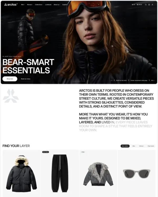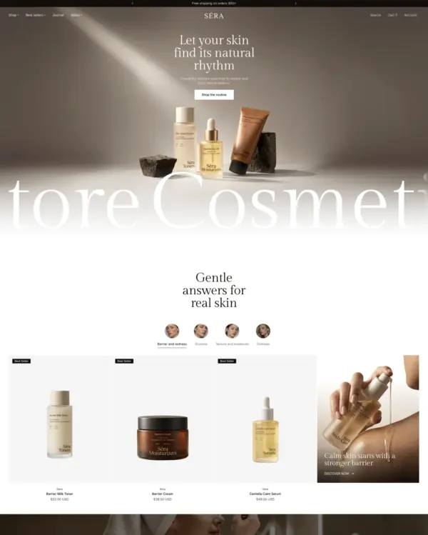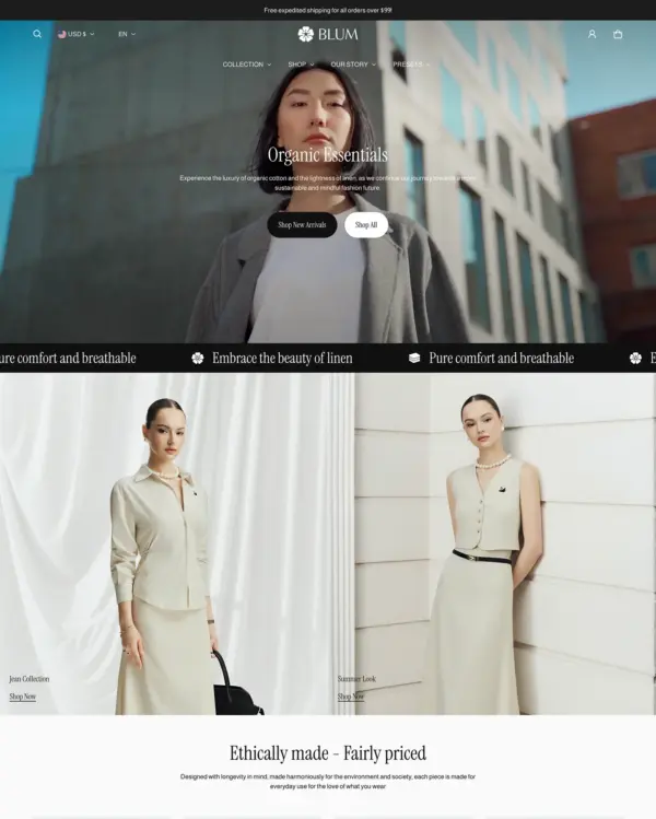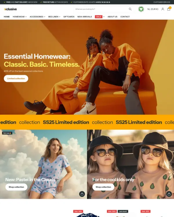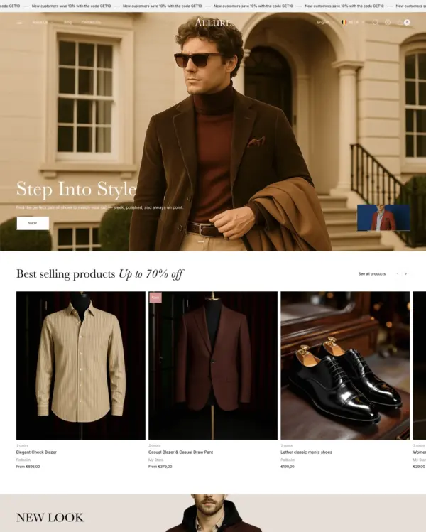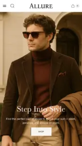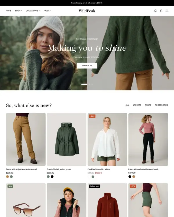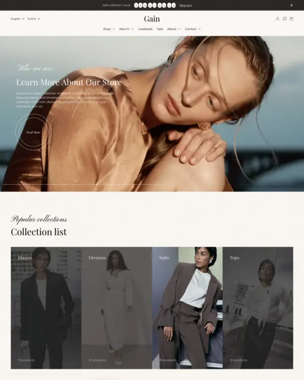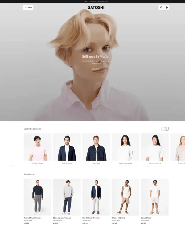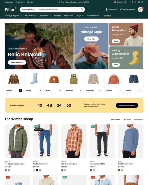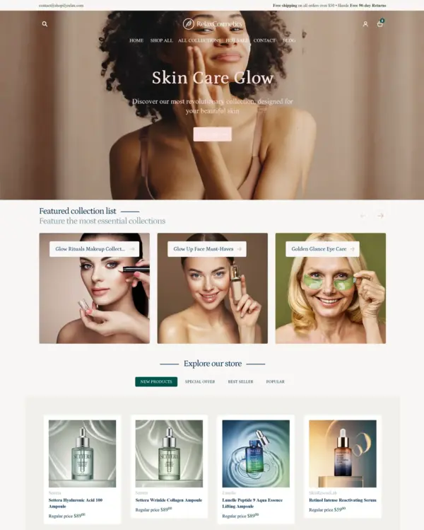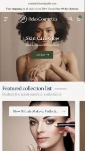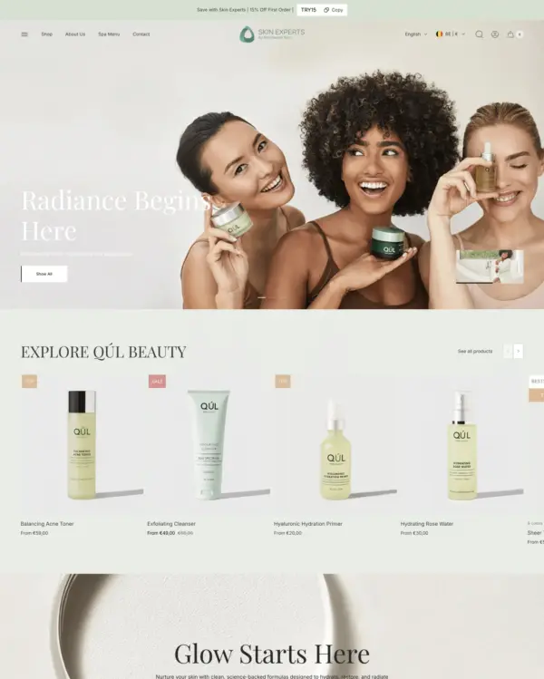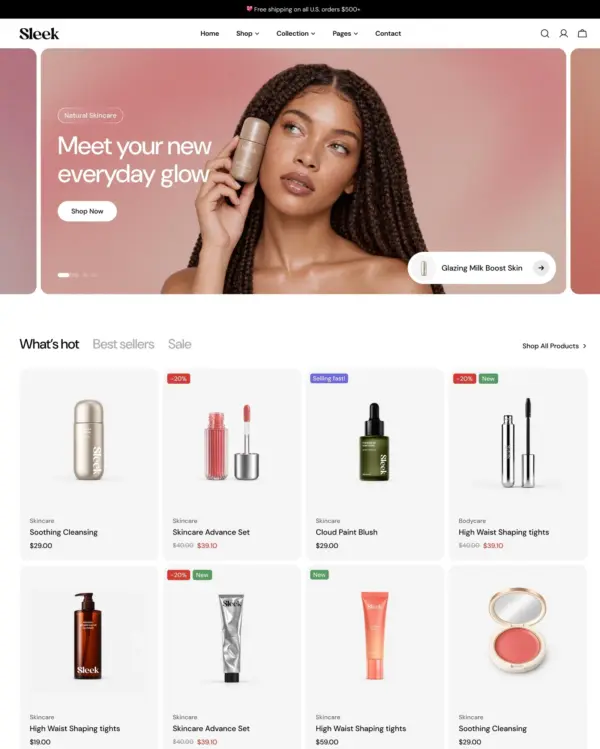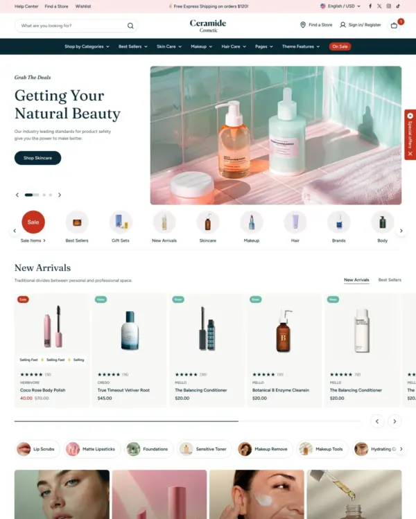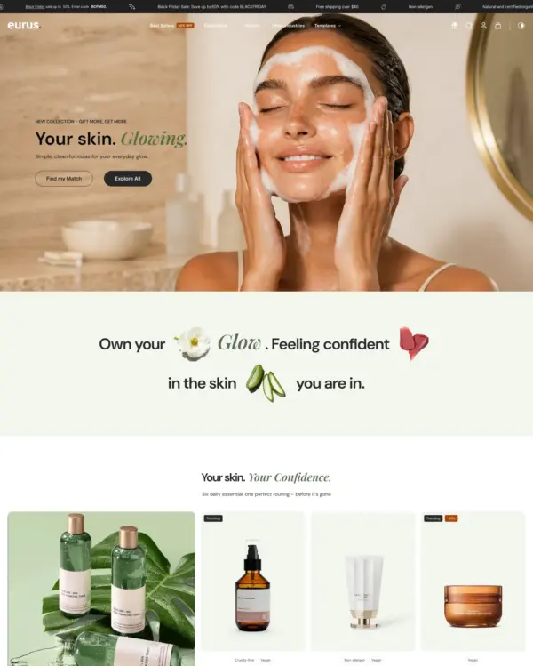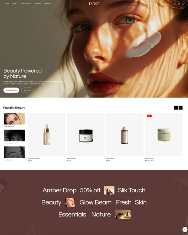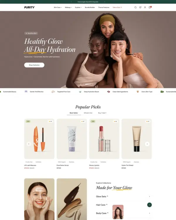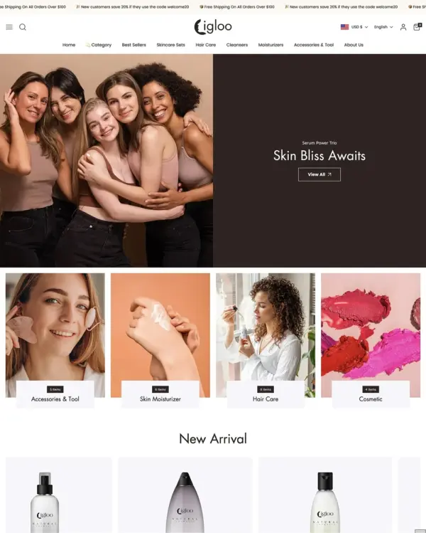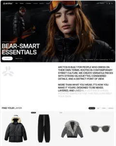
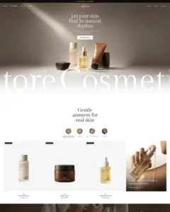
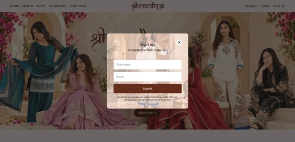
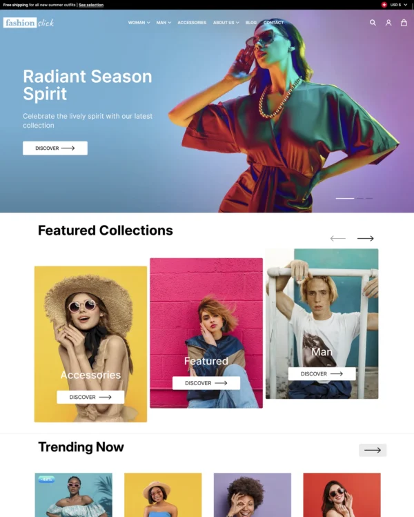

Clothing and lifestyle collections flow through lookbooks, product hotspots, and continuous scrolling.
Our verdict on Arctos
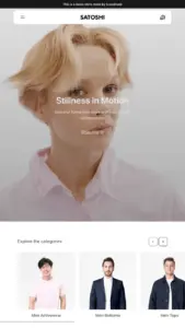
Arctos has a thoughtful idea for fashion brands: give the mobile storefront its own layout controls instead of treating it as a squeezed desktop design. The visual tools fit clothing and beauty well, but at $380 it is a substantial purchase for a theme with just four merchant reviews. Its single tested live store scored a respectable 74 on mobile, though that's far too little evidence for a broad performance verdict. We would shortlist it for a brand with strong mobile design requirements, then thoroughly trial both presets and the editing workflow before buying.

What we liked
- Independent mobile layout controls are genuinely useful when campaign artwork and product composition need different treatment on smaller screens.
- Lookbooks, swatches, and image hotspots suit fashion merchandising where showing how products work together matters more than dense specifications.
- The one tested live store scored 74 on mobile, exceeding the official demo's 65, an encouraging result worth checking with your own content.
Worth knowing
- Four reviews and one tested live store are a very small evidence base for a $380 theme; avoid drawing sweeping conclusions from either.
- The demo scored 65 mobile versus 90 desktop, so test image-heavy pages on real phones before relying on its speed positioning.
How fast is Arctos?
Google PageSpeed Insights scores out of 100. Demo results average the home, collection, and product pages.
The official Arctos demo scored 73/100 on mobile and 87/100 on desktop in our November 2026 test. On mobile, LCP was 6.1s, CLS 0.01 and Total Blocking Time 61ms.
Theme demo store
Official Arctos demo, average of 3 pages| By page | Mobile | Desktop |
|---|---|---|
| Home page | 72 | 75 |
| Collection page | 76 | 96 |
| Product page | 71 | 90 |
| Metric | Mobile | Desktop |
|---|---|---|
| Largest Contentful Paint | 6.9s | 1.7s |
| Cumulative Layout Shift | 0.00 | 0.00 |
| Total Blocking Time | 0ms | 253ms |
| Speed Index | 5.2s | 3.4s |
| Metric | Mobile | Desktop |
|---|---|---|
| Largest Contentful Paint | 5.5s | 1.1s |
| Cumulative Layout Shift | 0.04 | 0.07 |
| Total Blocking Time | 131ms | 0ms |
| Speed Index | 4.1s | 1.4s |
| Metric | Mobile | Desktop |
|---|---|---|
| Largest Contentful Paint | 6.1s | 1.4s |
| Cumulative Layout Shift | 0.00 | 0.00 |
| Total Blocking Time | 53ms | 35ms |
| Speed Index | 5.0s | 2.6s |
Lab data from PageSpeed Insights, Nov 2026
The live store we tested scored 74/100 on mobile and 97/100 on desktop. Its mobile LCP was 5.8s and CLS was 0.00. These are complete production stores, so the numbers cover more than the theme itself.
Live stores average
Mean across 1 store running Arctos| Metric | Mobile | Desktop |
|---|---|---|
| Largest Contentful Paint | 5.8s | 781ms |
| Cumulative Layout Shift | 0.00 | 0.01 |
| Total Blocking Time | 113ms | 95ms |
| Speed Index | 4.8s | 1.5s |
Real stores carry their own apps, images and traffic
Per-store results
1 live store · tested Nov 2026How fast is Sera?
Google PageSpeed Insights scores out of 100. Demo results average the home, collection, and product pages.
In our November 2026 test, the official Sera demo scored 73/100 on mobile and 93/100 on desktop. Mobile LCP was 7.1s, CLS was 0.01, and Total Blocking Time was 86ms.
Theme demo store
Official Sera demo, average of 3 pages| By page | Mobile | Desktop |
|---|---|---|
| Home page | 73 | 94 |
| Collection page | 73 | 94 |
| Product page | 73 | 91 |
| Metric | Mobile | Desktop |
|---|---|---|
| Largest Contentful Paint | 7.1s | 1.5s |
| Cumulative Layout Shift | 0.00 | 0.00 |
| Total Blocking Time | 65ms | 3ms |
| Speed Index | 4.4s | 1.4s |
| Metric | Mobile | Desktop |
|---|---|---|
| Largest Contentful Paint | 8.2s | 1.1s |
| Cumulative Layout Shift | 0.02 | 0.00 |
| Total Blocking Time | 43ms | 38ms |
| Speed Index | 4.2s | 2.0s |
| Metric | Mobile | Desktop |
|---|---|---|
| Largest Contentful Paint | 6.0s | 1.6s |
| Cumulative Layout Shift | 0.00 | 0.00 |
| Total Blocking Time | 149ms | 0ms |
| Speed Index | 4.6s | 1.9s |
Lab data from PageSpeed Insights, Nov 2026
On the live store we tested, the PageSpeed score was 74/100 on mobile and 97/100 on desktop. Its mobile LCP was 5.8s and CLS was 0.00. These are complete production stores, so the numbers cover more than the theme itself.
Live stores average
Mean across 1 store running Sera| Metric | Mobile | Desktop |
|---|---|---|
| Largest Contentful Paint | 5.8s | 781ms |
| Cumulative Layout Shift | 0.00 | 0.01 |
| Total Blocking Time | 113ms | 95ms |
| Speed Index | 4.8s | 1.5s |
Real stores carry their own apps, images and traffic
Per-store results
1 live store · tested Nov 2026Tracked over time
Tracked over time
Features
Cart and checkout
- Cart notes
- In-store pickups
- Pre-order
- Quick buy
- Sign in with Shop
- Slide-out cart
- Sticky cart
Customer accounts and sign-in
- Account menu
Marketing and conversion
- Blogs
- Countdown timer
- Cross-selling
- Customizable contact form
- EU translations (EN, FR, IT, DE, ES)
- FAQ page
- In-menu promos
- Product badges
- Promo banners
- Quick view
- Recommended products
- Stock counter
- Trust badges
- Quantity pricing (Shopify Plus)
Merchandising
- Animation
- Before/after image slider
- Color swatches
- High-resolution images
- Image galleries
- Image hotspot
- Image rollover
- Image zoom
- Ingredients or nutritional information
- Lookbooks
- Product options
- Product tabs
- Product videos
- Shipping/delivery information
- Size chart
- Slideshow
- Usage information
Product discovery
- Breadcrumbs
- Collection page navigation
- Enhanced search
- Infinite scroll
- Mega menu
- Product filtering and sorting
- Recommended products
- Sticky header
- Swatch filters
No features match your search.
Arctos ranking and satisfaction
Arctos Sera preset ranking and satisfaction
Examples of Shopify stores using the Arctos theme
Release history
Arctos has received 7 updates in the last 12 months.
Arctos 2.1.0 adds the Sera preset, new blocks for collection recommendations, compact product bundles and menu highlights, a reworked Before/after image slider, more layout and typography controls, and 15 more languages. Some settings are replaced or removed, so review the updated theme before publishing it (see Changed).
Added
- Added the Sera preset, designed for beauty and skincare stores, with its own colors, typography, and page layouts. It is available as a theme style alongside Arctos.
- Added a Collection recommendation block. Customers choose an option and a collection from dropdowns inside a sentence, such as "I have [option] skin and my top concern is [collection]", and the button takes them to the selected collection. An optional [sub-option] selector adds a second choice between the option and the collection. The selectors flow with the sentence like plain text, so a long value wraps line by line (cut to two lines). Add it to the Custom (including on the 404 page), Collection links, Contact, Gallery, Page, and Storytelling sections, or inside a Group, Sticky layout, Banner, Product list banner, Slideshow slide, product details Group, or featured collection or product content group.
- Added a Compact product bundle block. It lists a few products in compact rows with a variant picker for each, shows the bundle total, and adds the whole set to the cart with one Add all to cart button. Find it under Collections and products. Savings changes only the total shown in the block; write it as 9.5, 9,5, 1,234.56, or 1.234,56. To give customers the discount at checkout, create a matching automatic discount in Shopify admin.
- Added a Menu highlight block to the header and the Menu block. Highlight menu items by title with a Text color or a Badge with its own label, color, and optional icon.
- Added a Banner block to the Product list, with position, height, orientation, ratio, media, overlay, link, and hover settings, and a Product list with banner preset.
- Added media and icon tabs to the Tab item list: choose a Type, then set the media orientation, ratio, width, and corner radius, or the Icon size; media above the label is centered over it, and in a vertical list on desktop it follows the list Alignment. Tab text can also use the Display, Heading 1, Heading 2, and Description styles.
- Added the Outside Information position to the Collection list and Collection cards blocks, with Style (Classic or Boxed), Box style, and a separate image Corner radius that includes Pill. The Collection list block also gets a horizontal Direction, an image Width, and a Collection list picker. Horizontal cards keep at least 30% of the width for the title.
- Added custom title typography to the Collection list, Collection cards, and the Collection grid's All-products card: font family, size, line height, letter spacing, font weight, and Case, each with mobile overrides. Collection titles also get more text styles.
- Added Box style (Fill or Outline), Padding, and Use alternate background color to the All-products card in the Collection grid block.
- Added separate Horizontal gap and Vertical gap settings to the Collection list and Collection grid blocks.
- Added 9:16 and 3:4 ratios to collection cards, and a 9:16 mobile ratio to the Before/after image slider.
- Added Filters shown as buttons to the Filtering and sorting block, so you choose which filters show as buttons instead of a list. The default, Size, matches the previous behavior.
- Added Custom on mobile to the Filtering and sorting block's Padding, for the filter bar on mobile. When it is off, the bar keeps using the desktop padding on mobile, as before. The filter list on mobile opens in the filter drawer, which keeps its own spacing.
- Added Expand button style (Classic or Boxed, Fill or Outline) and a Pill corner radius to the Accordions block. The product General information block gets the same options plus expand button size, typography, gap, padding, and corner settings.
- Added a separate Quick view button type and Quick view button width, plus an alignment for a single quick action button, to Theme settings › Product card, the Product card block, and the Shop the Look product list.
- Added a border to the Cart products block, and Inherit and Landscape Media orientation options to cart items, the cart drawer, and product recommendations.
- Added Full-width when sticky to the Header, a mobile Text color to the Menu and mega menu Menu blocks, and a Fit menu width.
- Added six more color schemes, for twelve in total, under Theme settings › Colors. The Sera preset uses all twelve; in Arctos the new schemes start as copies of the first six, ready to customize.
- Added the Custom Liquid block to the Custom, Gallery, Storytelling, Contact, Collection links, and Page sections, so Liquid or app snippets can sit inside a section's layout. The Custom Liquid section is unchanged.
- The Group block now accepts app blocks. App blocks and Custom Liquid content fill their container, in a row or a column; place one in a Group to control its width and height.
- Added Hungarian, Danish, German, Italian, Japanese, Korean, Dutch, Polish, Portuguese (Brazil), Portuguese (Portugal), Russian, Swedish, Turkish, Chinese (Simplified), and Chinese (Traditional) storefront and Theme Editor translations.
Changed
- Important: Some settings are replaced or removed in this version. Review the updated theme before publishing it, especially Before/after image sliders, quick view buttons, Collection list and Collection cards blocks, and Tab item lists.
- Important: Reworked the Before/after image slider. Each side can now show its own product, with Show before product and Show after product and their own media, price, ratio, and hover settings. New settings include Initial position, Controls color scheme, Label visibility, label background and padding, Width, and Divider corner radius. Dragging the divider now has inertia and respects reduced motion. After updating, product cards stay hidden until you turn them on again, and the previous product, corner radius, color scheme, media padding, and mobile label position and alignment settings return to their defaults. The Middle label position is no longer available. Split direction labels now describe the divider line, so Horizontal and Vertical appear swapped while the layout stays the same.
- Quick view buttons now have their own type. Stores that used the Text or Mix quick action type will see an icon quick view button until Quick view button type is set again.
- The Collection list block replaces its previous corner radius, custom spacing, gap, and mobile product count settings with the new layout settings. The Collection cards block replaces its custom spacing and mobile product count settings. Review these blocks after updating.
- The Collection grid's gap settings are replaced by Horizontal gap and Vertical gap. Custom gap values return to the default.
- The Tab item list no longer has separate mobile width settings.
- The default gap in the Cart products block now follows the theme spacing.
- The All-products card in the Collection grid block is now shown by default and inherits the section's color scheme by default. Stores that never changed Show All-products card or Inherit color scheme will see the card after updating, with a filled box, padding, and the alternate background color.
- The expand button in the Accordions block and the product General information block now uses the heading color instead of the primary button color, and outline expand buttons use the divider color for their border. In the General information block, a Pill corner radius now keeps rows rounded without turning open rows into ovals.
- "Square" corner options are now labeled "Sharp".
- The "Image ratio" setting for cart items is now labeled Media orientation.
- Custom font sizes now range from 10 to 200 px, including in the top bar Text block.
- Accordion menus are full width on mobile.
- Dropdowns and predictive search results now fit inside the screen.
- In the Bento layout, a full-screen first section now reveals the next section as you scroll.
- Renamed five section presets: Hero banner with marquee is now Hero banner, Countdown banner is Countdown, Collection recommendation is Recommendation, Stats is Statistic numbers, and Team members is Team. Sections already on a page keep their content.
- Tables in rich text now have an outer border with row and column dividers instead of a filled background, and scroll sideways when they are wider than the page. Size chart tables keep their borderless layout.
- The selected variant pill and the active filter buttons now use the color scheme's primary button colors.
- A Tab item with an empty Label is no longer shown, so the tab list cannot contain an unnamed tab.
- The filter sidebar and filter drawer now use the Filtering and sorting block's Color scheme when Inherit color scheme is off; before, only the filter bar did, and the filter list used the theme's default color scheme. The filter drawer also uses the block's Background instead of the collection or search results section's.
- The filter and sorting bar now switches to its mobile layout and mobile padding below 992 px, like the rest of the theme, instead of below 769 px.
Fixed
- Fixed the shipping estimator for stores that ship to a single country.
- Fixed blurry testimonial avatars.
- Fixed the Title color preset when the default text style is used.
- Fixed swatch colors so the correct color takes priority.
- Fixed app block padding on the product page on mobile.
- Fixed the sticky variant picker showing for products without variants.
- Fixed the untranslated home label in breadcrumbs.
- Fixed app blocks not using the full width in Custom sections.
- Fixed the product category link.
- Fixed the position of the cart count in the cart drawer.
- Fixed the collection page heading background and corner radius.
- Fixed the padding of filter buttons on desktop and mobile.
- Fixed filter, sorting, language, and predictive search dropdowns closing while a control inside them updates, and the mega menu closing when the pointer moves onto a quick view, quick add, or image zoom window opened from it.
- Fixed Add to cart submitting more than once when Enter is pressed repeatedly while the cart is updating.
- Fixed words dropping onto their own line in animated text inside tabs and slideshows on Safari.
- Fixed carousels, accordions, videos, tabs, and sort dropdowns affecting other copies of the same section or block on a page.
- Fixed repeated form IDs in the gift card recipient form, shipping estimator, buy buttons, and country selector when they appear more than once on a page.
- Fixed the search page All tab showing only the first results, and not loading more, after a card block was hidden and a setting changed in the Theme Editor. The search drawer heading now names only the result types the page shows.
- Fixed keyboard focus on the Sort, Items per page, Language, and Country dropdowns: the focused item is highlighted the same way as on hover.
- Fixed struck-through prices sitting too low in Safari.
- Fixed SVG images in Image blocks with an Auto orientation being squashed in Safari.
- Fixed filter checkboxes in the filter drawer being skipped by the Tab key in Safari.
- Fixed the filter sidebar shifting left and hiding its filter names after the Theme Editor preview or the browser window changes from mobile to desktop width.
- Fixed the "+N" color count overflowing narrow product cards.
- Fixed long prices in compact product cards being clipped instead of shortened, and article images overflowing their card.
- Fixed the quick add button keeping its label padding in narrow compact product cards; it is now a square (or round) icon button.
Arctos 2.0.4 is a hotfix for 2.0.3. It fixes product grids breaking apart on the live storefront when product cards use the image carousel or slide hover effect, fixes images missing from scrolling marquees, and adds custom product badges from product tags. Settings, templates, and saved content are unchanged from 2.0.3.
Added
- Added custom product badges from product tags. Tag a product
badge:followed by the badge text, for examplebadge:Pre-orderorbadge:Staff pick, to show that text as a solid badge on product cards and on the product page. The prefix is not case-sensitive, and a product can have several badge tags. Wherever these tags appear as collection filters, including the quick filter, they show without thebadge:prefix.
Fixed
- Fixed product cards breaking out of the grid on collection pages and other product lists, which left large empty gaps and full-width cards on desktop and mobile. This affected stores where Theme settings › Product card › Hover interaction (or a block's own hover setting) is Image carousel, or Reveal second image with the Slide transition, and products have two or more images. The issue appeared only on the live storefront, not in the Theme Editor preview, and was introduced in 2.0.2.
- Fixed images missing from the repeated copies of a scrolling marquee, which left empty gaps as the marquee scrolled. This affected marquees with image items further down the page on desktop when Theme settings › General › Animation on scroll is on. Items inside a marquee now appear with the marquee instead of fading in one by one. The issue was present since 2.0.0.
Arctos 2.0.3 is a hotfix for 2.0.2. It restores the layout of the View as grid switcher on collection pages. Settings, templates, and saved content are unchanged from 2.0.2.
Fixed
- Fixed the View as grid switcher on collection pages showing only one layout option. All layout options appear side by side again, as in 2.0.1.
Arctos 2.0.2 is a maintenance update that adds quick-action button sizing, more mobile typography controls, and app-block support in more sections. It makes desktop and mobile media overrides independent, fixes full-height Sticky Content media and hover-dimming states, and refines how images, fonts, overlays, and autoplay media load. The shipped Arctos templates are unchanged from 2.0.1.
Added
- Added a Button width setting (Fit or Fill) for text-style quick add and quick view buttons. It is available in Theme settings › Product card, in the Product card block, and in the Lookbook and Product list blocks. Fit remains the default.
- Added Custom on mobile and a mobile Title text style (Heading 5, Heading 6, or Paragraph) for the All-products card in the Collection grid block.
- Added a mobile Font family setting (Heading or Body) to the top-bar Menu block when its mobile text style is custom.
- Added Description and Label text styles to the Author block, and a Description text style to testimonial text.
- Added app-block support to the Custom section, 404, Collection links, Contact, Footer, Gallery, Page, Password, Storytelling, Popup, and Announcement bar sections.
Fixed
- Fixed media backgrounds in full-height Sticky Content columns so they fill the column on desktop.
- Fixed active and selected items, such as the current quick filter, being dimmed in hover-dimming groups. Keyboard focus now dims sibling items only for keyboard navigation, not after a mouse click.
- Fixed long product countdown text overflowing instead of wrapping.
- Fixed the minimum width of the quantity animation in the buy buttons.
- Improved Theme Editor live preview for nested announcement and mega-menu blocks, carousels, and listings.
Changed
- Changed mobile media overrides to be strictly independent. When a mobile media override is enabled, mobile shows only the mobile media and no longer falls back to the desktop image or video. If the mobile field is empty, a placeholder is shown. Desktop never uses mobile media. This applies to backgrounds, video, before/after, Shop the look, and media with hover overlays.
- Changed the collection page heading background. It uses the collection image when Show image is enabled and the collection has an image; otherwise it now uses the configured custom media background.
- Changed custom font sizes in the Author, Testimonial text, and Testimonial list blocks from number fields to sliders (12–200 px, in steps of 2). Default sizes are unchanged. If you entered a size outside 12–200 px or an odd value, check it in the Theme Editor after updating.
- Renamed the Collection card block to Collection cards and relabeled its title setting Title preset.
- Changed swatch images to load as lazily loaded images.
- Refined boxed tab corners and alignment, made vertical boxed tab buttons full width, and made tab dividers responsive in column layouts.
- Refined media and asset loading. Images show a lightweight preview before loading at full quality. An Image block now loads eagerly only when it is the first block in the first section. Font preloads are limited to two files. Closed drawers and popups render after the main page content. Slideshow and video autoplay start after the first visitor interaction.
Removed
- Removed the global Variant picker › Color swatches › Style theme setting. Each Variant picker and Quick view block's own swatch type setting now applies; its default is Color swatch. If you previously chose Variant image globally, check the swatch setting on those blocks after updating.
- Removed the Subheading option from the Collection cards Title preset and the All-products card title text style. Stores that used it fall back to the default style.
- Removed the unused legacy custom section (
sc_custom). It had no presets and is not used by the Arctos templates.
Arctos 2.0.1 is a maintenance update that keeps header behavior consistent across published storefront languages and refreshes the shipped Arctos storefront templates with the latest responsive layout, color, collection, and product-page configuration.
Added
- Enabled the All-products card in the collection-list template using portable default content and styling, with support for its custom-background presentation.
- Added the required static product-card and contact-form name, email, description, and action blocks to the one-column and two-column product-grid templates.
Fixed
- Fixed inside-header positioning on localized homepages such as
/fr,/es, and other published language roots. Localized homepages now follow the same homepage settings as/. - Fixed header and top-bar specific-page targeting across localized URLs. Generic paths apply across languages, while paths beginning with a published locale root remain locale-specific.
- Fixed mega-menu connections when top-level navigation labels are translated. Mega menus now use Shopify's stable link handle first, with the rendered label retained as a compatibility fallback.
- Fixed desktop header layouts that could be displaced by longer translated navigation labels. Menu regions can now shrink and wrap without pushing the logo, localization controls, or utilities out of position.
- Fixed the simple blog-listing template to use article-aware pagination instead of the generic page-pagination block.
- Preserved explicit color-scheme pairings for non-inheriting cards, groups, and sections across blog, collection, lookbook, about, and product-grid templates.
- Improved reveal-component lifecycle cleanup by releasing focus listeners and observer-queue entries when components disconnect.
Changed
- Made mega-menu connection names and header and top-bar specific-page lists language-neutral configuration values, preventing Translate & Adapt entries from changing structural header behavior.
- Clarified the English, French, and Spanish Theme Editor guidance for mega-menu connections and language-aware specific-page paths.
- Refined homepage mobile presentation with the intended slideshow fullscreen behavior, content alignment, responsive padding, section height, and inline video mode.
- Standardized the product-information grid so the countdown spans the full row while the feature group and buy buttons each occupy half a row across the standard and alternative product templates.
- Changed the shipped Arctos product-card transition from slide to fade.
- Removed inactive saved values from the article template when their controlling carousel, margin, mobile-image, or custom-typography settings are disabled; this cleanup does not change storefront rendering.
What merchants say about Arctos Shopify theme
Merchant sentiment summary
5 of 6 reviews rate Arctos positively.
Based on all 6 Theme Store reviews
Arctos has received 6 reviews in the last 12 months.