
Fastest
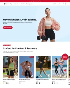
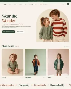
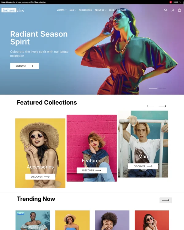
Swissuplabs 3 presets
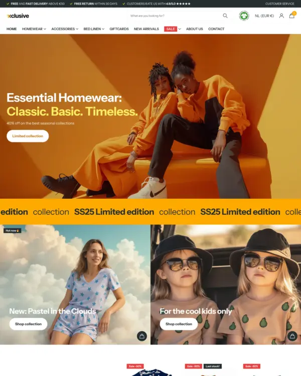
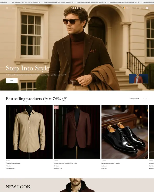
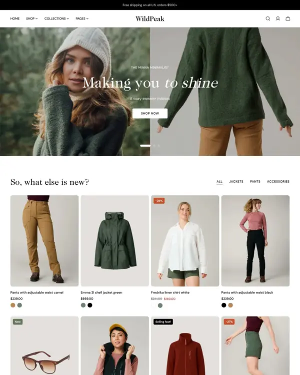
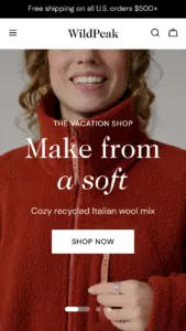
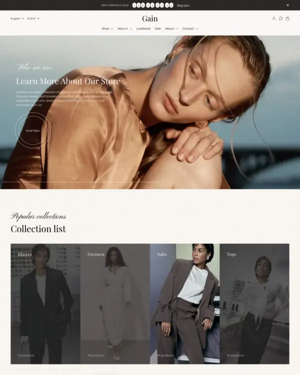
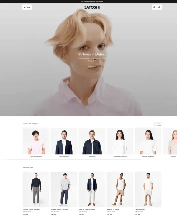
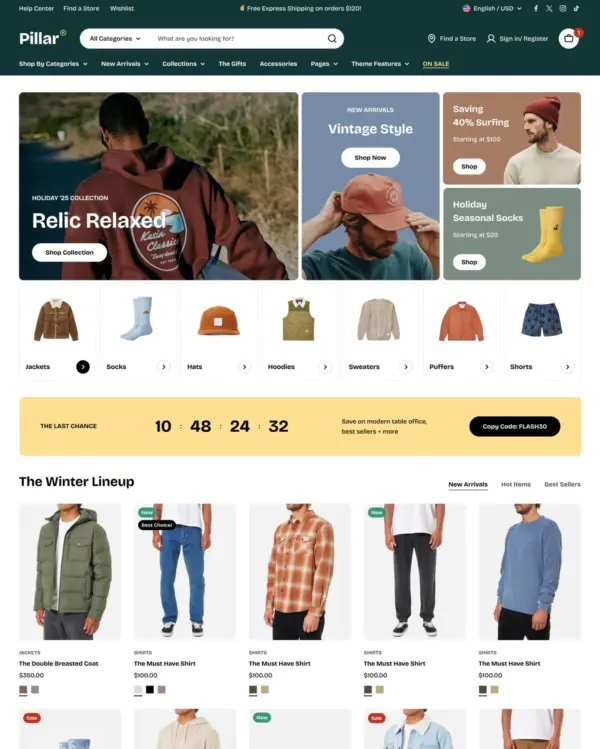
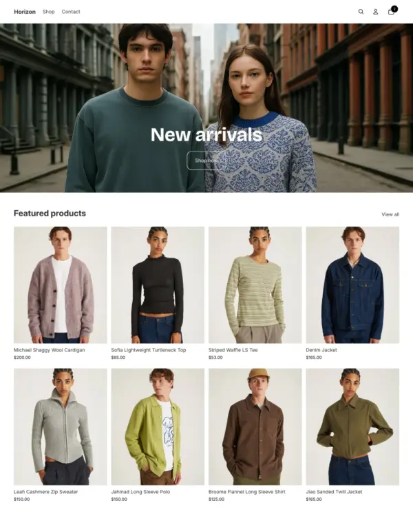
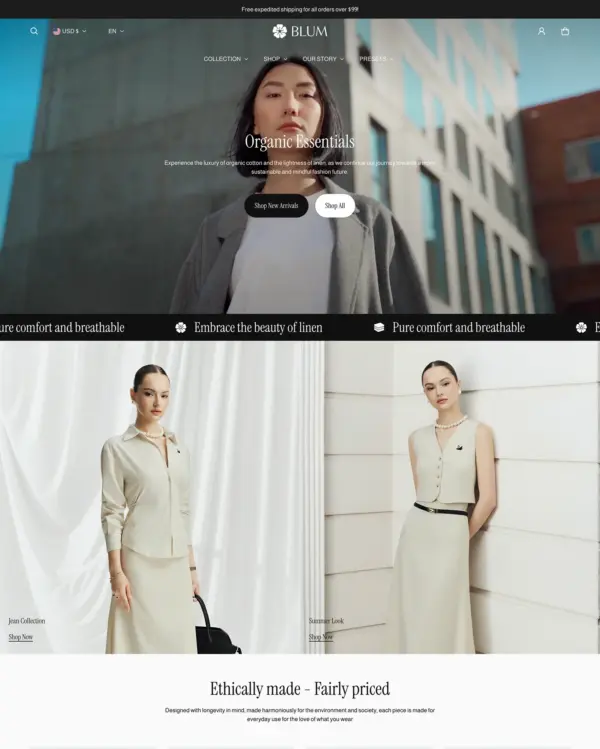
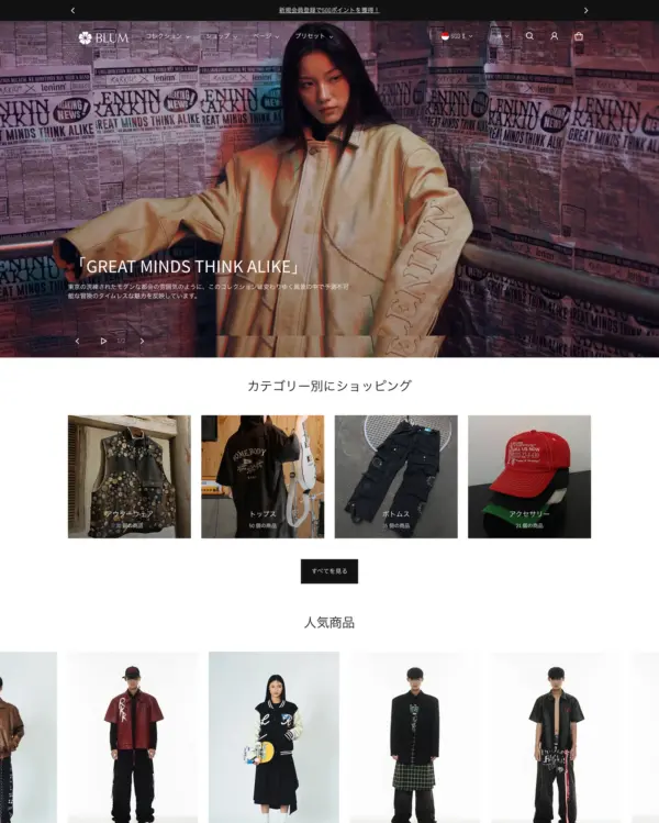
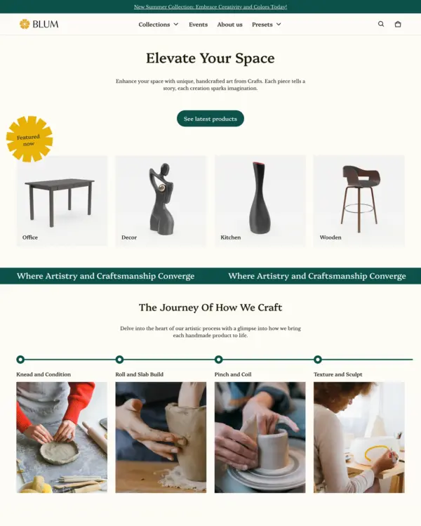
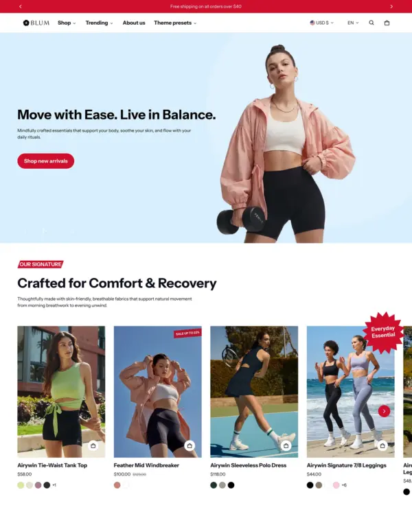
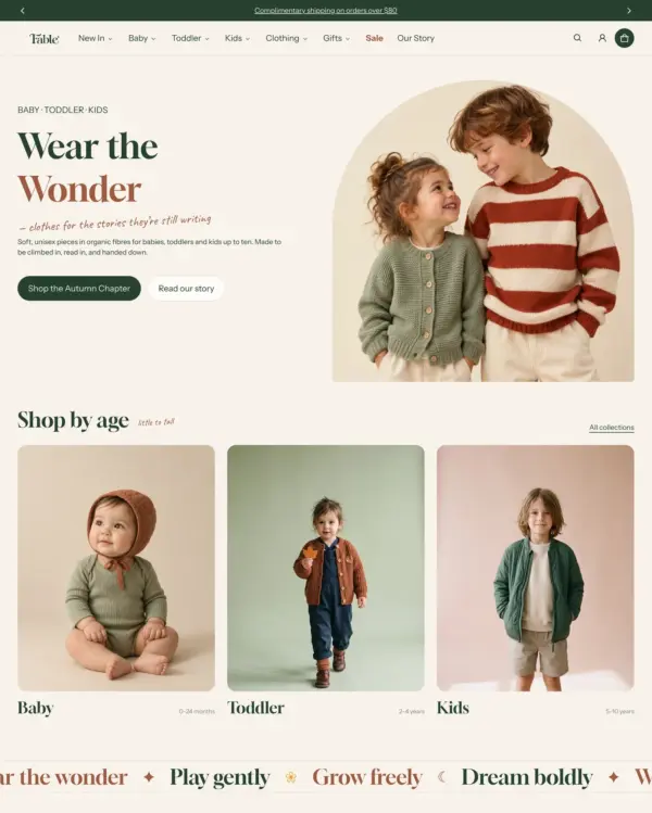
Clothing and lifestyle collections flow through lookbooks, product hotspots, and continuous scrolling.
Clothing Sports Jewelry and accessories
5.0 · 18 reviews $ 120





Created by eComX
Independently reviewed by the eDIY editorial team
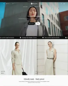
Blum is an unusually attractive value for fashion retailers who sell complete outfits rather than isolated items. Its shop-the-look approach connects campaign images to products naturally, and the $170 price is accessible beside many premium fashion themes. The 265 merchant reviews are overwhelmingly positive, which strengthens the case for choosing it over a newer design with little feedback. We'd still pay attention to real performance: the official demo scored 82 on mobile, while eight tested stores averaged 52. Blum has the tools for a convincing apparel shop, but photography, scripts and image-heavy layouts can change the speed story considerably.

Google PageSpeed Insights scores out of 100. Demo results average the home, collection, and product pages.
In our November 2026 test, the official Blum demo scored 78/100 on mobile and 99/100 on desktop. On mobile, LCP was 6.1s, CLS 0.00 and Total Blocking Time 7ms.
| By page | Mobile | Desktop |
|---|---|---|
| Home page | 72 | 99 |
| Collection page | 76 | 98 |
| Product page | 86 | 100 |
| Metric | Mobile | Desktop |
|---|---|---|
| Largest Contentful Paint | 7.3s | 821ms |
| Cumulative Layout Shift | 0.00 | 0.00 |
| Total Blocking Time | 22ms | 1ms |
| Speed Index | 4.2s | 1.2s |
| Metric | Mobile | Desktop |
|---|---|---|
| Largest Contentful Paint | 6.7s | 1.0s |
| Cumulative Layout Shift | 0.00 | 0.00 |
| Total Blocking Time | 0ms | 0ms |
| Speed Index | 3.2s | 806ms |
| Metric | Mobile | Desktop |
|---|---|---|
| Largest Contentful Paint | 4.2s | 652ms |
| Cumulative Layout Shift | 0.00 | 0.00 |
| Total Blocking Time | 0ms | 0ms |
| Speed Index | 2.0s | 842ms |
Lab data from PageSpeed Insights, Nov 2026
The 8 live stores we tested averaged 59/100 on mobile and 88/100 on desktop. Average mobile LCP was 15.5s and CLS was 0.08. These results reflect complete production stores, not the theme alone.
| Metric | Mobile | Desktop |
|---|---|---|
| Largest Contentful Paint | 15.5s | 2.0s |
| Cumulative Layout Shift | 0.08 | 0.03 |
| Total Blocking Time | 202ms | 120ms |
| Speed Index | 7.2s | 1.7s |
Real stores carry their own apps, images and traffic
Google PageSpeed Insights scores out of 100. Demo results average the home, collection, and product pages.
Tested in November 2026, the official Fuji demo scored 94/100 on mobile and 99/100 on desktop. On mobile, LCP was 2.8s, CLS 0.00 and Total Blocking Time 58ms.
| By page | Mobile | Desktop |
|---|---|---|
| Home page | 89 | 99 |
| Collection page | 96 | 99 |
| Product page | 97 | 99 |
| Metric | Mobile | Desktop |
|---|---|---|
| Largest Contentful Paint | 3.2s | 721ms |
| Cumulative Layout Shift | 0.00 | 0.00 |
| Total Blocking Time | 117ms | 21ms |
| Speed Index | 4.9s | 1.1s |
| Metric | Mobile | Desktop |
|---|---|---|
| Largest Contentful Paint | 2.6s | 894ms |
| Cumulative Layout Shift | 0.00 | 0.00 |
| Total Blocking Time | 17ms | 0ms |
| Speed Index | 2.3s | 762ms |
| Metric | Mobile | Desktop |
|---|---|---|
| Largest Contentful Paint | 2.5s | 682ms |
| Cumulative Layout Shift | 0.00 | 0.00 |
| Total Blocking Time | 40ms | 3ms |
| Speed Index | 3.0s | 1.0s |
Lab data from PageSpeed Insights, Nov 2026
The 8 live stores we tested averaged 59/100 on mobile and 88/100 on desktop. Average mobile LCP was 15.5s and CLS was 0.08. These are complete production stores, so the numbers cover more than the theme itself.
| Metric | Mobile | Desktop |
|---|---|---|
| Largest Contentful Paint | 15.5s | 2.0s |
| Cumulative Layout Shift | 0.08 | 0.03 |
| Total Blocking Time | 202ms | 120ms |
| Speed Index | 7.2s | 1.7s |
Real stores carry their own apps, images and traffic
Google PageSpeed Insights scores out of 100. Demo results average the home, collection, and product pages.
Tested in November 2026, the official Totem demo scored 88/100 on mobile and 99/100 on desktop. On mobile, LCP was 3.9s, CLS 0.00 and Total Blocking Time 0ms.
| By page | Mobile | Desktop |
|---|---|---|
| Home page | 89 | 99 |
| Collection page | 81 | 99 |
| Product page | 95 | 100 |
| Metric | Mobile | Desktop |
|---|---|---|
| Largest Contentful Paint | 3.7s | 801ms |
| Cumulative Layout Shift | 0.00 | 0.00 |
| Total Blocking Time | 0ms | 22ms |
| Speed Index | 2.7s | 1.0s |
| Metric | Mobile | Desktop |
|---|---|---|
| Largest Contentful Paint | 5.0s | 923ms |
| Cumulative Layout Shift | 0.00 | 0.00 |
| Total Blocking Time | 0ms | 0ms |
| Speed Index | 1.5s | 739ms |
| Metric | Mobile | Desktop |
|---|---|---|
| Largest Contentful Paint | 2.9s | 801ms |
| Cumulative Layout Shift | 0.00 | 0.00 |
| Total Blocking Time | 0ms | 8ms |
| Speed Index | 1.6s | 726ms |
Lab data from PageSpeed Insights, Nov 2026
The 8 live stores we tested averaged 59/100 on mobile and 88/100 on desktop. Average mobile LCP was 15.5s and CLS was 0.08. These results reflect complete production stores, not the theme alone.
| Metric | Mobile | Desktop |
|---|---|---|
| Largest Contentful Paint | 15.5s | 2.0s |
| Cumulative Layout Shift | 0.08 | 0.03 |
| Total Blocking Time | 202ms | 120ms |
| Speed Index | 7.2s | 1.7s |
Real stores carry their own apps, images and traffic
Google PageSpeed Insights scores out of 100. Demo results average the home, collection, and product pages.
Tested in November 2026, the official Solie demo scored 77/100 on mobile and 98/100 on desktop. Mobile LCP was 5.8s, CLS was 0.00, and Total Blocking Time was 2ms.
| By page | Mobile | Desktop |
|---|---|---|
| Home page | 71 | 99 |
| Collection page | 78 | 98 |
| Product page | 84 | 99 |
| Metric | Mobile | Desktop |
|---|---|---|
| Largest Contentful Paint | 6.7s | 681ms |
| Cumulative Layout Shift | 0.00 | 0.00 |
| Total Blocking Time | 0ms | 68ms |
| Speed Index | 5.2s | 1.1s |
| Metric | Mobile | Desktop |
|---|---|---|
| Largest Contentful Paint | 6.3s | 1.0s |
| Cumulative Layout Shift | 0.00 | 0.00 |
| Total Blocking Time | 0ms | 0ms |
| Speed Index | 2.1s | 761ms |
| Metric | Mobile | Desktop |
|---|---|---|
| Largest Contentful Paint | 4.4s | 861ms |
| Cumulative Layout Shift | 0.00 | 0.01 |
| Total Blocking Time | 6ms | 9ms |
| Speed Index | 3.4s | 1.0s |
Lab data from PageSpeed Insights, Nov 2026
Across 8 live stores we tested, the average PageSpeed score was 59/100 on mobile and 88/100 on desktop. Average mobile LCP was 15.5s and CLS was 0.08. These are complete production stores, so the numbers cover more than the theme itself.
| Metric | Mobile | Desktop |
|---|---|---|
| Largest Contentful Paint | 15.5s | 2.0s |
| Cumulative Layout Shift | 0.08 | 0.03 |
| Total Blocking Time | 202ms | 120ms |
| Speed Index | 7.2s | 1.7s |
Real stores carry their own apps, images and traffic
Google PageSpeed Insights scores out of 100. Demo results average the home, collection, and product pages.
In our November 2026 test, the official Fable demo scored 77/100 on mobile and 94/100 on desktop. On mobile, LCP was 5.7s, CLS 0.00 and Total Blocking Time 10ms.
| By page | Mobile | Desktop |
|---|---|---|
| Home page | 75 | 94 |
| Collection page | 76 | 95 |
| Product page | 81 | 94 |
| Metric | Mobile | Desktop |
|---|---|---|
| Largest Contentful Paint | 5.7s | 1.4s |
| Cumulative Layout Shift | 0.00 | 0.00 |
| Total Blocking Time | 25ms | 1ms |
| Speed Index | 4.3s | 1.3s |
| Metric | Mobile | Desktop |
|---|---|---|
| Largest Contentful Paint | 6.6s | 1.5s |
| Cumulative Layout Shift | 0.00 | 0.00 |
| Total Blocking Time | 4ms | 0ms |
| Speed Index | 3.6s | 1.0s |
| Metric | Mobile | Desktop |
|---|---|---|
| Largest Contentful Paint | 4.8s | 1.5s |
| Cumulative Layout Shift | 0.00 | 0.00 |
| Total Blocking Time | 0ms | 0ms |
| Speed Index | 3.4s | 1.1s |
Lab data from PageSpeed Insights, Nov 2026
The 8 live stores we tested averaged 59/100 on mobile and 88/100 on desktop. Average mobile LCP was 15.5s and CLS was 0.08. These results reflect complete production stores, not the theme alone.
| Metric | Mobile | Desktop |
|---|---|---|
| Largest Contentful Paint | 15.5s | 2.0s |
| Cumulative Layout Shift | 0.08 | 0.03 |
| Total Blocking Time | 202ms | 120ms |
| Speed Index | 7.2s | 1.7s |
Real stores carry their own apps, images and traffic
No features match your search.


Blum has received 7 updates in the last 12 months.
This update fixes the layout of the password page pop-up, makes heading accents work in every section and rounds section images to match the cards.
This release introduces the new Fable style, new Video shop, Shop the look and Collection rows sections, cart suggestions, heading accent typography, and a series of header, mega menu, product, search, blog and page template improvements.
This release adds support for the Shopify customer account component in the header, a label position option for the vertical Before/After layout, and fixes for the Images with Text Scroll and product variant blocks.
This release introduces pre-order support, new FAQ and Images with Text Scroll sections, a revamped Before/After section, product disclosures for the product page, cart, and cart drawer, and a series of parallax, slideshow, and accessibility improvements.
prefers-reduced-motion.This release introduces new interactive sections, a parallax scroll effect for banner sections, an age verification popup, and a full rebrand from SalesHunterThemes to eComX.
263 of 265 reviews are positive, 0 neutral and 2 negative. Merchants most often praise the responsive, hands-on support team, the clean and customisable design, and the site speed. The only recurring criticism is about the theme's feature set, and the two negative reviews are isolated rather than a clear pattern.
Generated from all 265 Theme Store reviews ·
Blum has received 60 reviews in the last 12 months.
Clothing and lifestyle collections flow through lookbooks, product hotspots, and continuous scrolling.
Turns editorial fashion and jewelry images into shoppable displays, with continuous product browsing.
Puts fashion photography first, letting customers explore outfits through lookbooks and shoppable images.
Blends words, images, and video in beauty pages, with an interactive drawer for searching products.
Combines apparel lookbooks and size charts with AI-assisted page setup and a sticky shopping cart.
Puts detailed apparel and accessory photography first, with precise layouts and interactive lookbooks.
Designed for wholesale shopping, with bulk order lists and pricing tools for business customers.
Keeps apparel shopping simple with oversized product cards, continuous scrolling, and restock alerts.
Clothing and lifestyle collections flow through lookbooks, product hotspots, and continuous scrolling.
Turns editorial fashion and jewelry images into shoppable displays, with continuous product browsing.
Puts fashion photography first, letting customers explore outfits through lookbooks and shoppable images.
Blends words, images, and video in beauty pages, with an interactive drawer for searching products.
Combines apparel lookbooks and size charts with AI-assisted page setup and a sticky shopping cart.
Puts detailed apparel and accessory photography first, with precise layouts and interactive lookbooks.
Designed for wholesale shopping, with bulk order lists and pricing tools for business customers.
Keeps apparel shopping simple with oversized product cards, continuous scrolling, and restock alerts.
Takes a lightweight approach to home shopping, with built-in suggestions for related products.
Combines apparel lookbooks and size charts with AI-assisted page setup and a sticky shopping cart.
Shows jewelry and clothing through interactive lookbooks, with the option to preorder products.
Presents trend-led fashion through video and lookbooks, with alerts when popular items return to stock.
Lets fashion, beauty, and jewelry stores mix product imagery with comparisons and promotional popups.
Lets fashion boutiques tell a more curated story with lookbooks, press coverage, and assisted setup.
Designed for furniture and home stores, with lookbooks and image hotspots that bring products into focus.
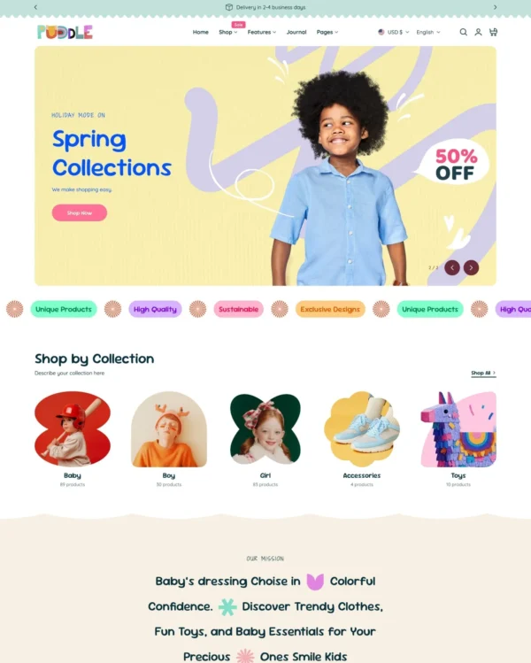
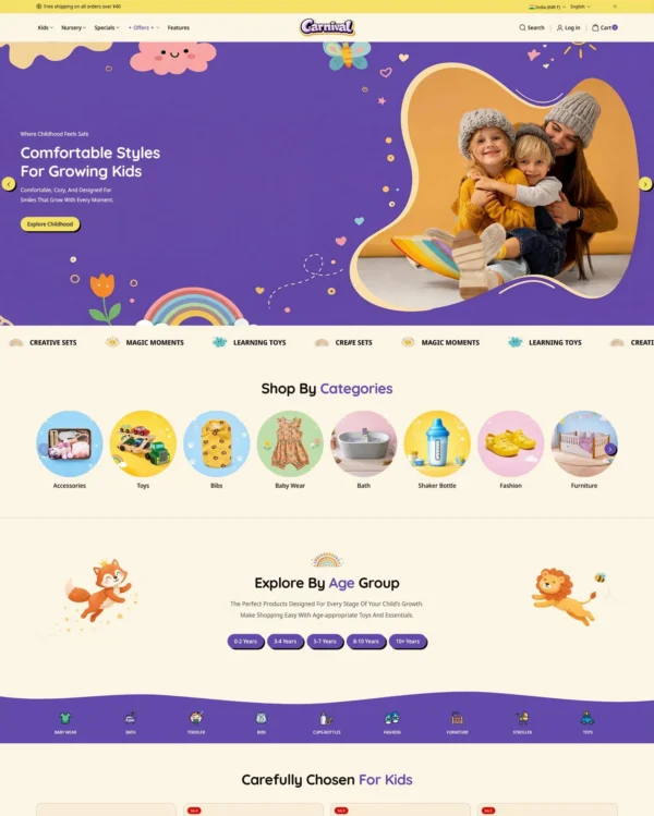
Brings a fluid, animated look to children's fashion, with nested layouts, lookbooks, and video.
Helps electronics shoppers check specifications quickly, with product previews and bulk upsell tools.
Handles both retail and wholesale beauty orders, including hidden guest prices, quick orders, and RTL layouts.
Clickable photos and quick previews make polished home and lifestyle galleries easier to explore.
Keeps electronics and phone accessories simple to browse with clear filters and a sticky add-to-cart bar.
Lets fashion brands turn campaign imagery into shopping opportunities with hotspots and lookbooks.
Lets fashion, beauty, and jewelry stores mix product imagery with comparisons and promotional popups.
Combines lifestyle lookbooks with product bundles, quizzes, and subscription shopping options.
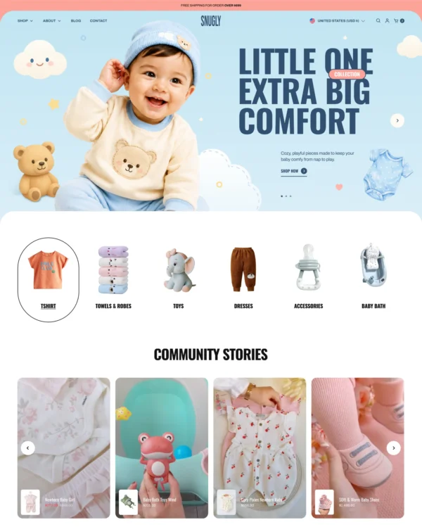
Brings a fluid, animated look to children's fashion, with nested layouts, lookbooks, and video.
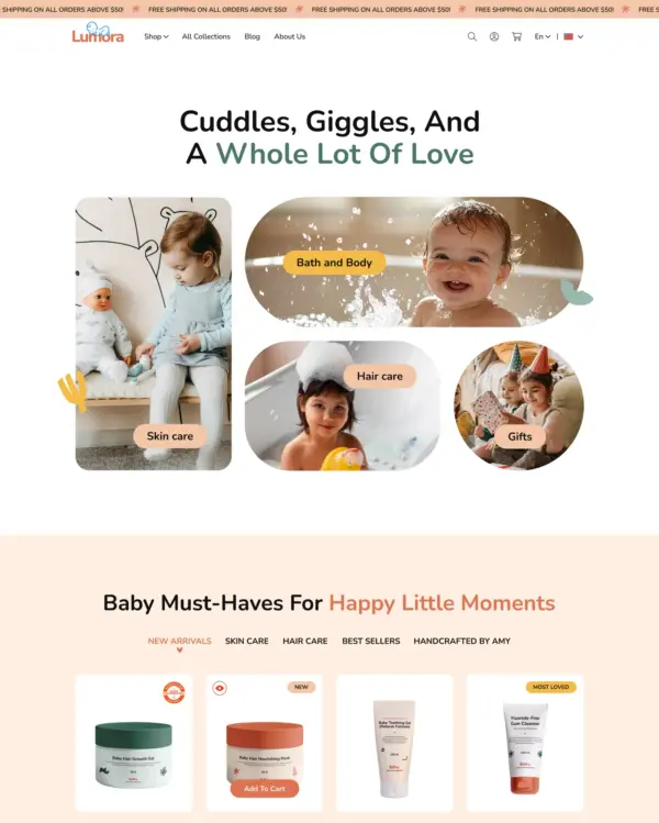
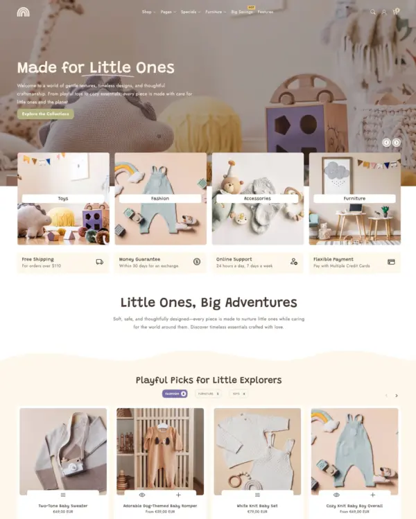
Cheerful colors and interactive lookbooks give toy and baby shops a friendly feel, with trust badges.
Brings an elegant look to larger pet and lifestyle catalogs, with lookbooks and continuous scrolling.
Brings a fluid, animated look to children's fashion, with nested layouts, lookbooks, and video.
Keeps clothing and jewelry catalogs flexible, with detailed filters, lookbooks, and product comparisons.
Combines cultural design influences with fashion lookbooks, dynamic menus, and right-to-left support.
Lets wellness and lifestyle stores adjust product grids and make images interactive with hotspots.
Lets fashion shoppers buy several pieces from a lookbook image with built-in product bundles.
Makes lifestyle browsing comfortable on touchscreens, with photo filters and sticky purchase buttons.