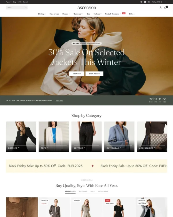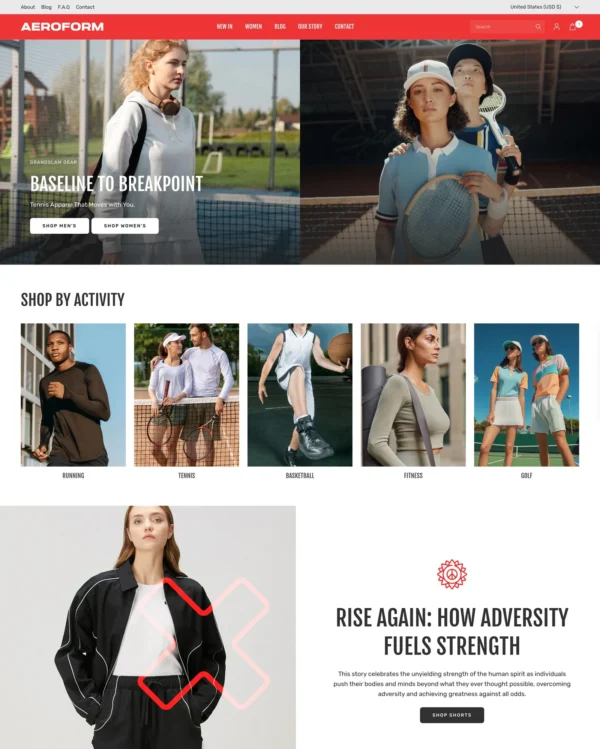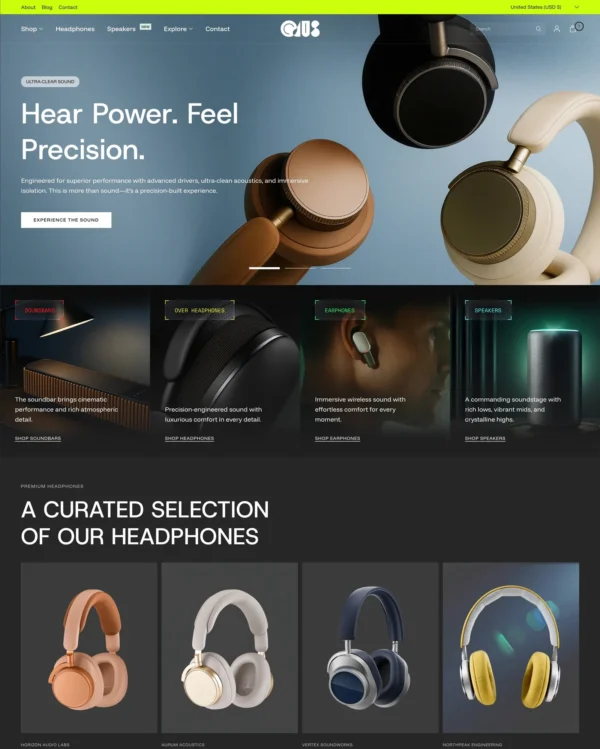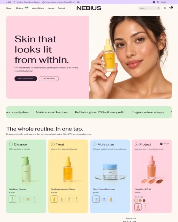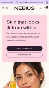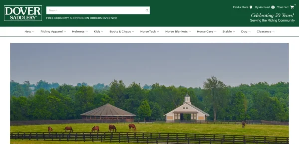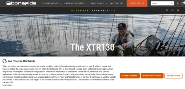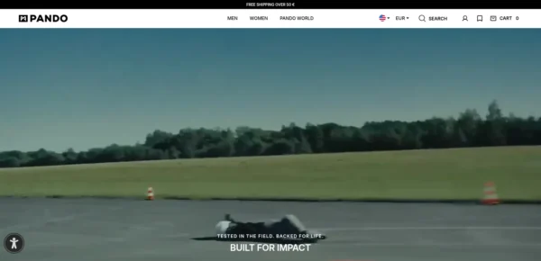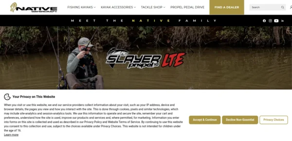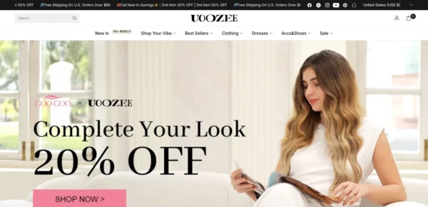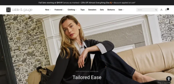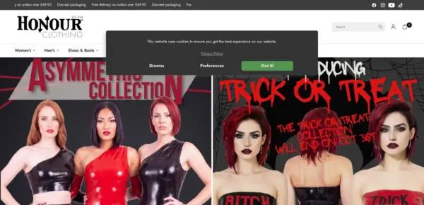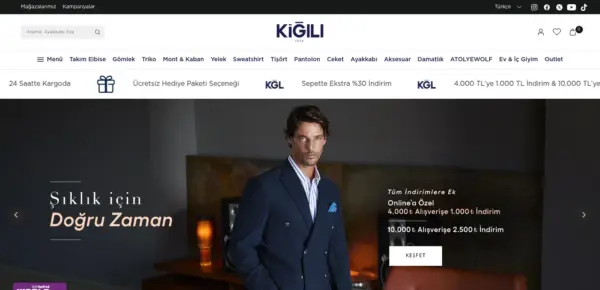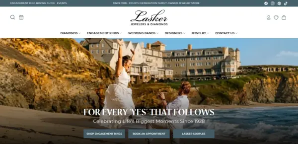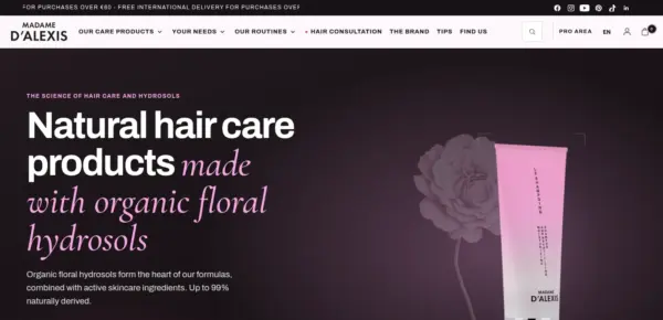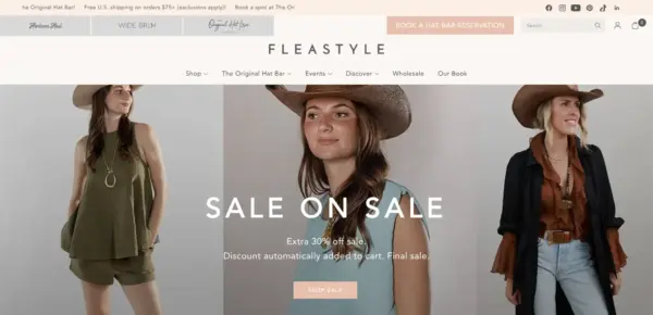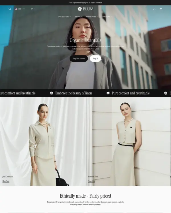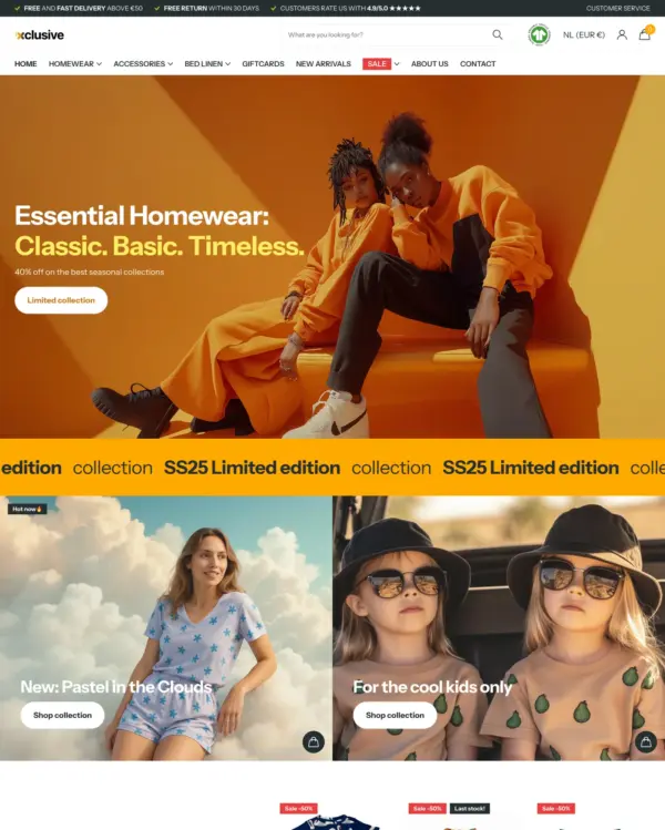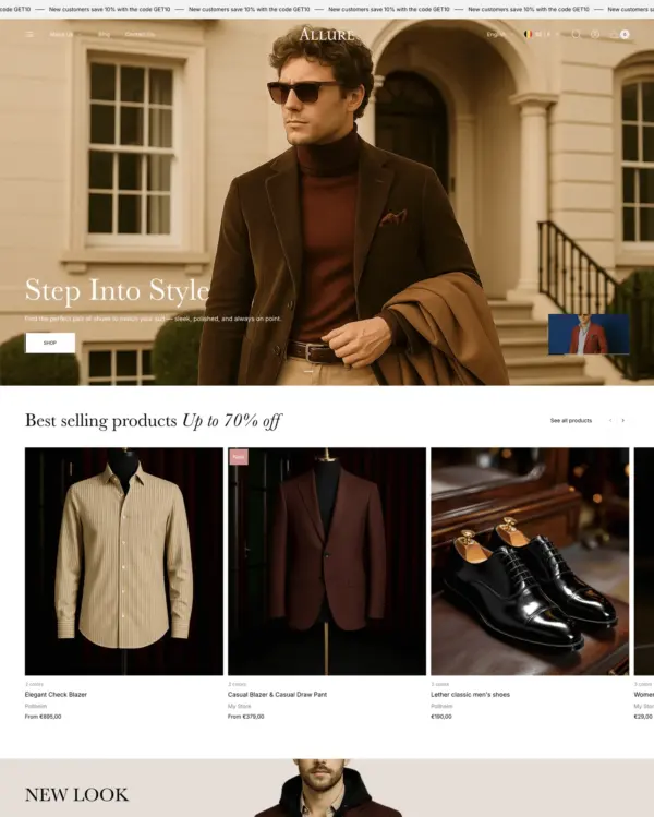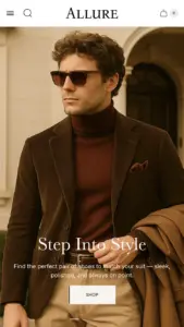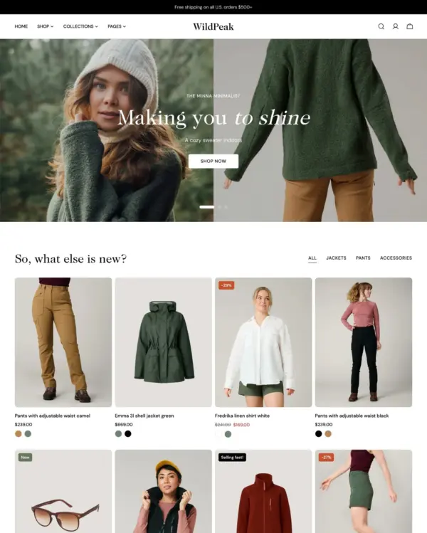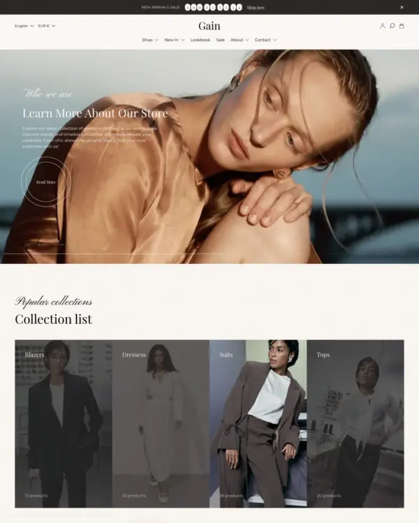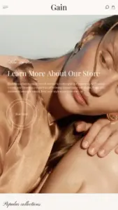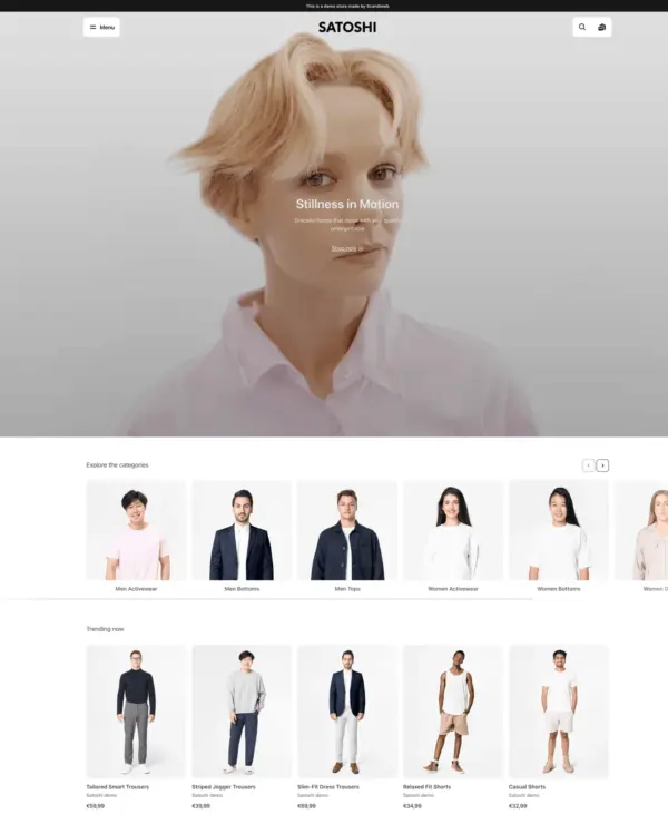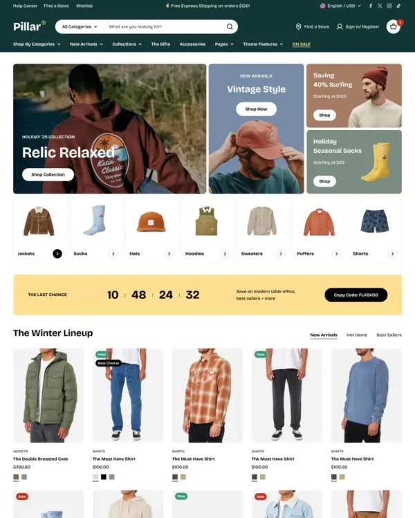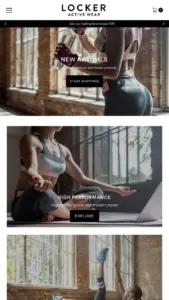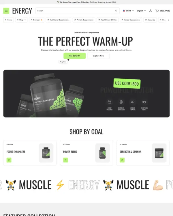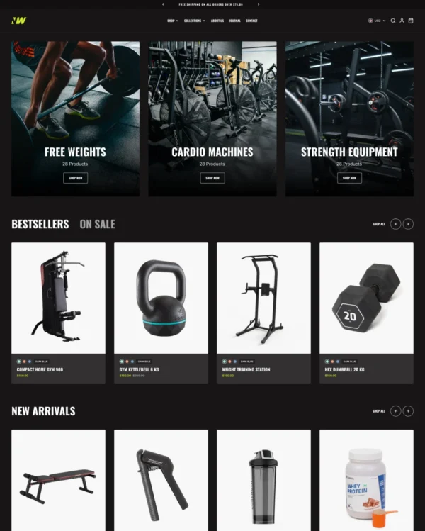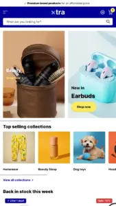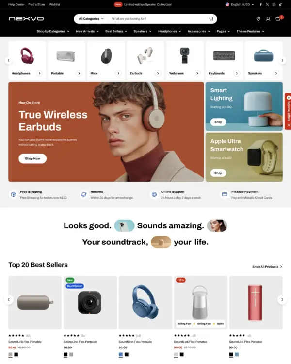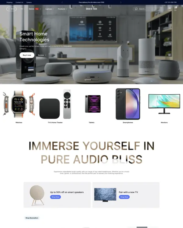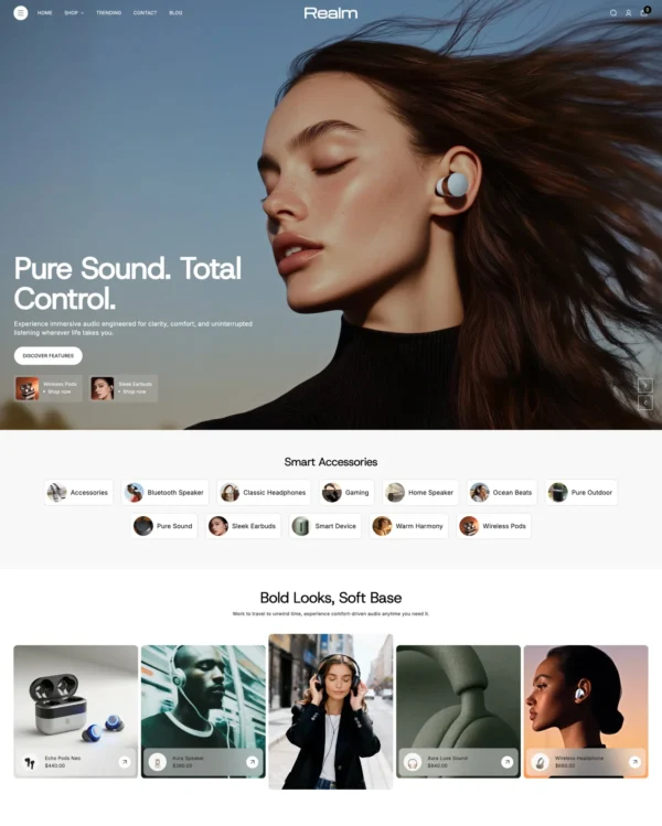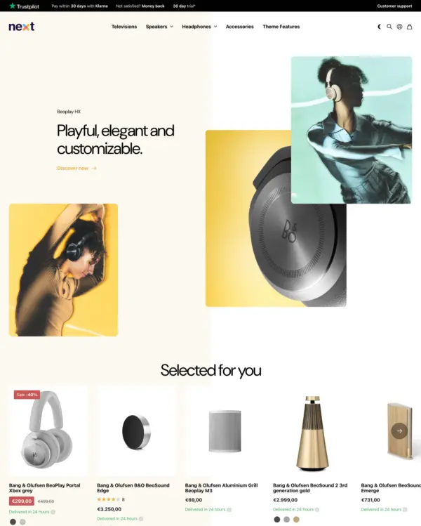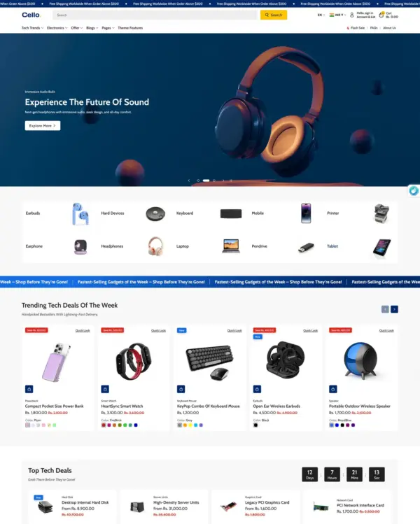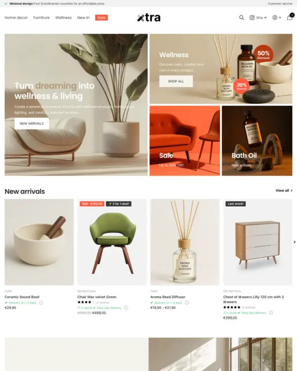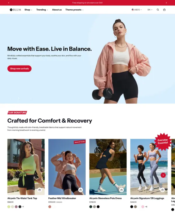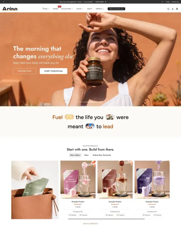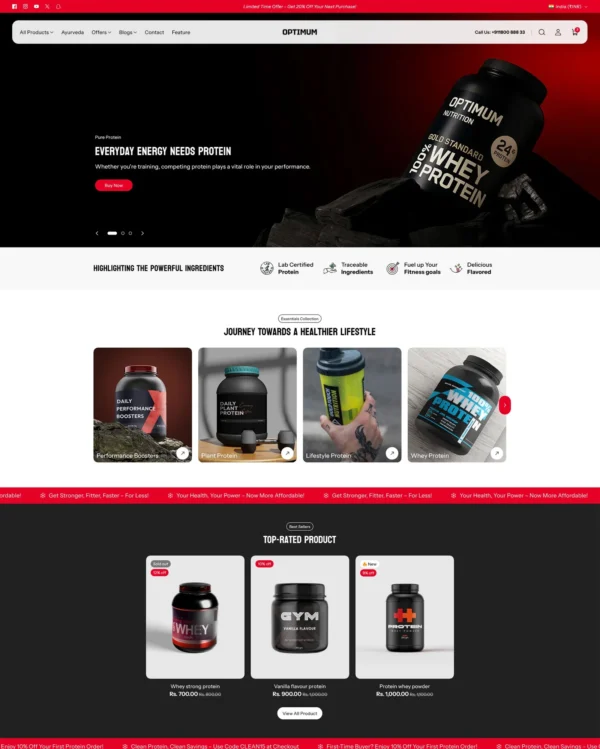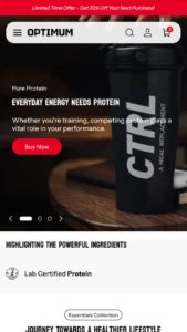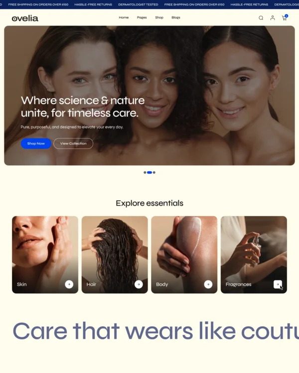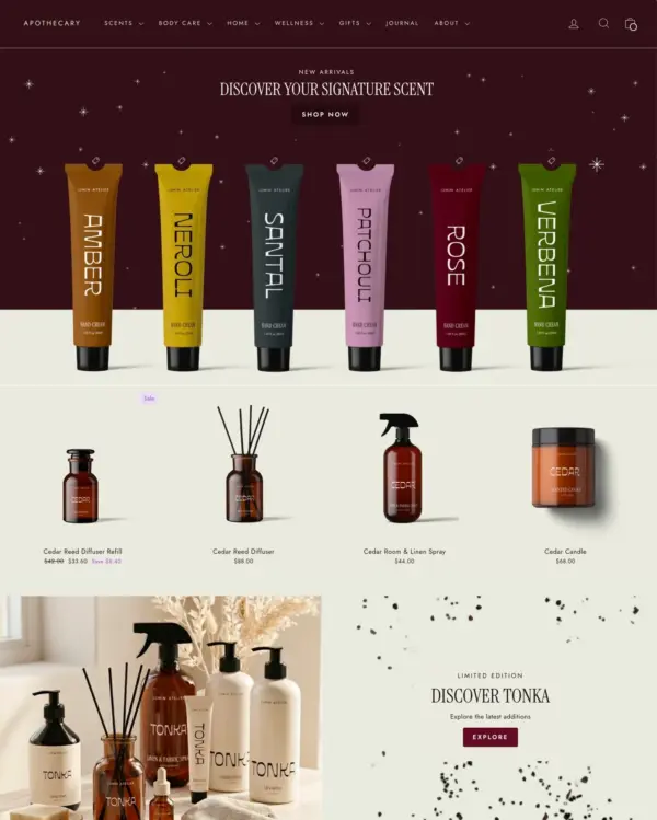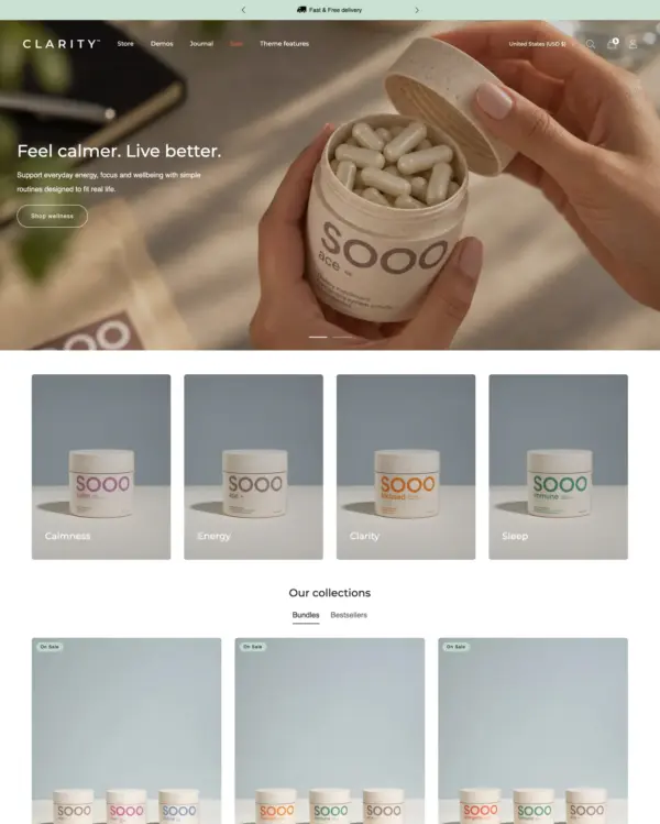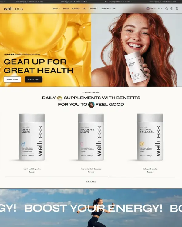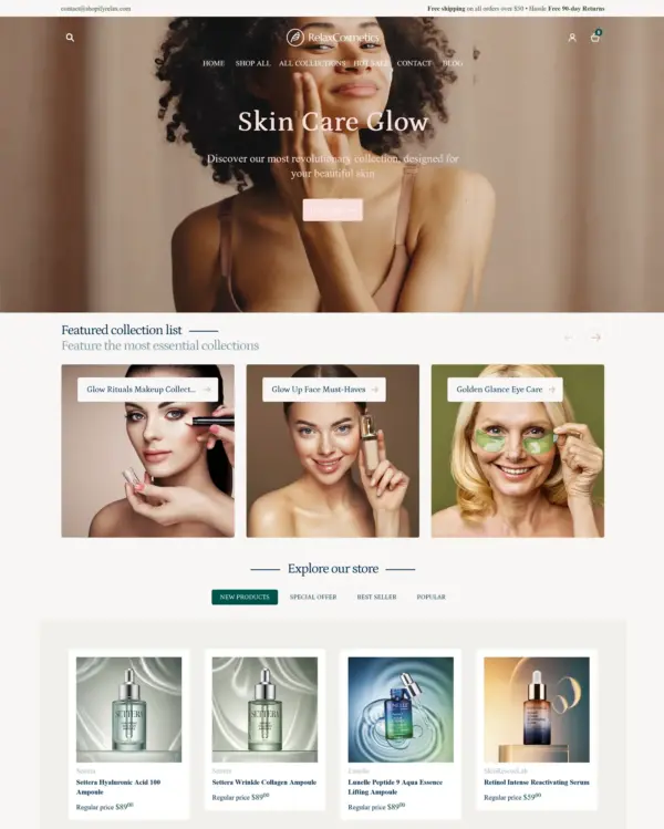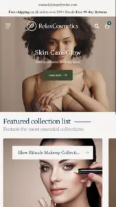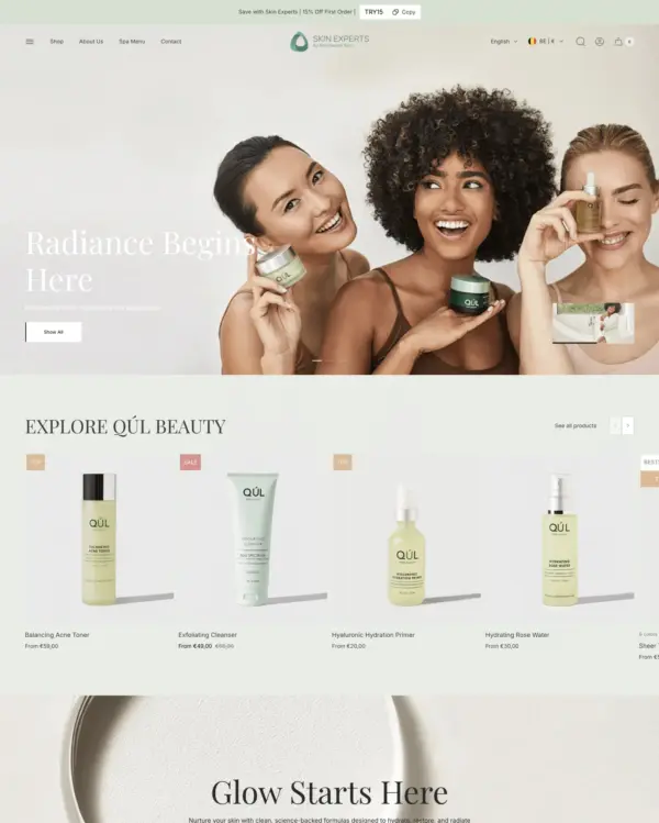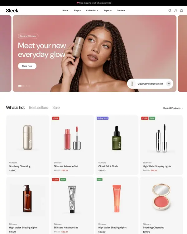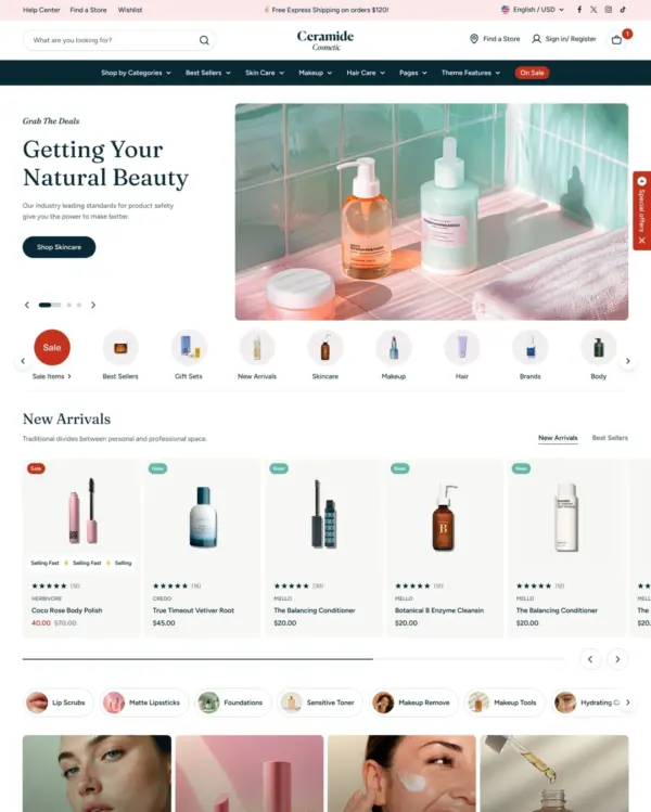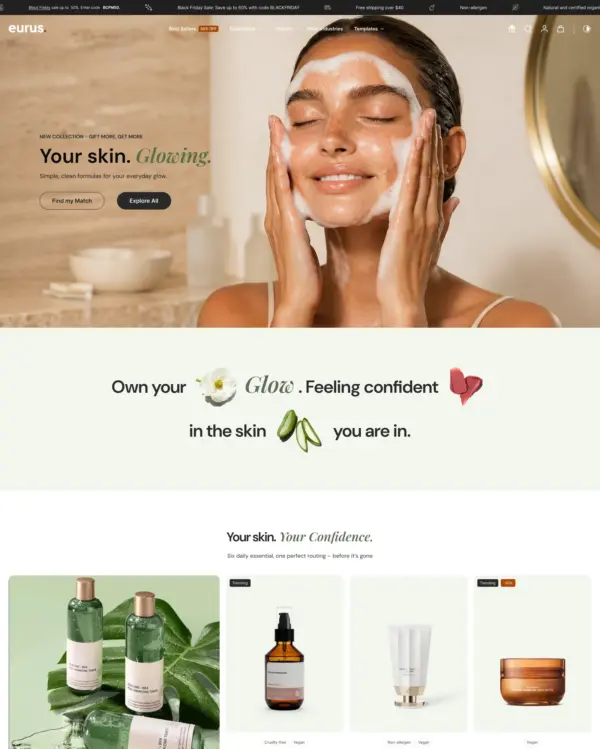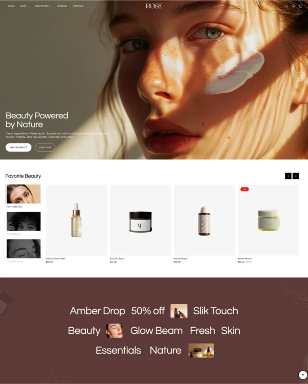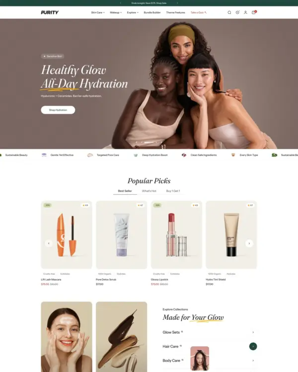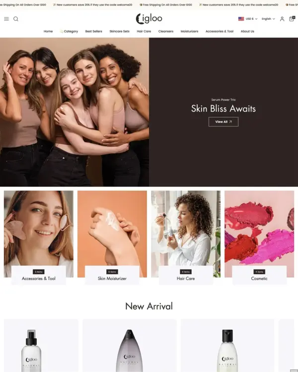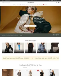
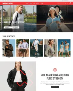
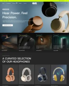
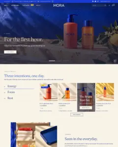
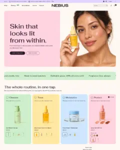
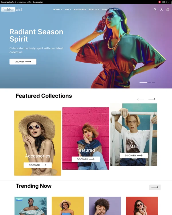
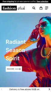
Clothing and lifestyle collections flow through lookbooks, product hotspots, and continuous scrolling.
Our verdict on Ascension
Ascension aims at the premium end of fashion and lifestyle retail, where the product page should feel deliberately designed rather than assembled from standard blocks. Five adjustable product layouts are the clearest reason to consider it, especially alongside visual comparison and lookbook options. Its 94% positive rating across 18 reviews is encouraging but limited. At $400, the bigger concern is what happens after launch: eight tested live stores averaged 48 on mobile and 63 on desktop, far below the main demo's 85 and 89. We would buy for its visual flexibility, not on the assumption of automatic speed.

What we liked
- Five product-page layouts offer meaningful room to tailor how luxury goods, clothing and jewelry are presented without custom templates.
- The combination of visual comparisons, lookbooks and product video suits brands that need to show detail and craftsmanship clearly.
- Seventeen of 18 published reviews are positive, with merchants particularly appreciative of the developer’s knowledgeable responses.
Worth knowing
- The eight tested live stores averaged 48 mobile and 63 desktop, compared with the official demo’s 85 and 89.
- At $400, Ascension should earn its cost through the layouts you actually need, not the total number of available sections.
How fast is Ascension?
Google PageSpeed Insights scores out of 100. Demo results average the home, collection, and product pages.
The official Ascension demo scored 80/100 on mobile and 93/100 on desktop in our November 2026 test. On mobile, LCP was 5.0s, CLS 0.07 and Total Blocking Time 41ms.
Theme demo store
Official Ascension demo, average of 3 pages| By page | Mobile | Desktop |
|---|---|---|
| Home page | 88 | 86 |
| Collection page | 64 | 94 |
| Product page | 88 | 99 |
| Metric | Mobile | Desktop |
|---|---|---|
| Largest Contentful Paint | 3.5s | 1.1s |
| Cumulative Layout Shift | 0.00 | 0.00 |
| Total Blocking Time | 106ms | 267ms |
| Speed Index | 4.1s | 1.4s |
| Metric | Mobile | Desktop |
|---|---|---|
| Largest Contentful Paint | 7.7s | 1.4s |
| Cumulative Layout Shift | 0.22 | 0.05 |
| Total Blocking Time | 11ms | 0ms |
| Speed Index | 3.0s | 1.3s |
| Metric | Mobile | Desktop |
|---|---|---|
| Largest Contentful Paint | 3.8s | 781ms |
| Cumulative Layout Shift | 0.00 | 0.02 |
| Total Blocking Time | 5ms | 4ms |
| Speed Index | 3.1s | 953ms |
Lab data from PageSpeed Insights, Nov 2026
The 8 live stores we tested averaged 55/100 on mobile and 68/100 on desktop. Average mobile LCP was 11.5s and CLS was 0.01. These results reflect complete production stores, not the theme alone.
Live stores average
Mean across 8 stores running Ascension| Metric | Mobile | Desktop |
|---|---|---|
| Largest Contentful Paint | 11.5s | 2.1s |
| Cumulative Layout Shift | 0.01 | 0.02 |
| Total Blocking Time | 783ms | 765ms |
| Speed Index | 8.1s | 2.4s |
Real stores carry their own apps, images and traffic
Per-store results
8 live stores · tested Nov 2026How fast is Aeroform?
Google PageSpeed Insights scores out of 100. Demo results average the home, collection, and product pages.
Tested in November 2026, the official Aeroform demo scored 81/100 on mobile and 98/100 on desktop. Mobile LCP was 4.9s, CLS was 0.05, and Total Blocking Time was 10ms.
Theme demo store
Official Aeroform demo, average of 3 pages| By page | Mobile | Desktop |
|---|---|---|
| Home page | 80 | 99 |
| Collection page | 78 | 98 |
| Product page | 87 | 98 |
| Metric | Mobile | Desktop |
|---|---|---|
| Largest Contentful Paint | 5.1s | 881ms |
| Cumulative Layout Shift | 0.04 | 0.00 |
| Total Blocking Time | 13ms | 0ms |
| Speed Index | 3.7s | 1.0s |
| Metric | Mobile | Desktop |
|---|---|---|
| Largest Contentful Paint | 5.5s | 1.1s |
| Cumulative Layout Shift | 0.07 | 0.03 |
| Total Blocking Time | 17ms | 0ms |
| Speed Index | 3.1s | 1.0s |
| Metric | Mobile | Desktop |
|---|---|---|
| Largest Contentful Paint | 4.0s | 1.1s |
| Cumulative Layout Shift | 0.03 | 0.04 |
| Total Blocking Time | 0ms | 0ms |
| Speed Index | 2.9s | 943ms |
Lab data from PageSpeed Insights, Nov 2026
Across 8 live stores we tested, the average PageSpeed score was 55/100 on mobile and 68/100 on desktop. Average mobile LCP was 11.5s and CLS was 0.01. These are complete production stores, so the numbers cover more than the theme itself.
Live stores average
Mean across 8 stores running Aeroform| Metric | Mobile | Desktop |
|---|---|---|
| Largest Contentful Paint | 11.5s | 2.1s |
| Cumulative Layout Shift | 0.01 | 0.02 |
| Total Blocking Time | 783ms | 765ms |
| Speed Index | 8.1s | 2.4s |
Real stores carry their own apps, images and traffic
Per-store results
8 live stores · tested Nov 2026How fast is Opus?
Google PageSpeed Insights scores out of 100. Demo results average the home, collection, and product pages.
In our November 2026 test, the official Opus demo scored 75/100 on mobile and 98/100 on desktop. On mobile, LCP was 4.9s, CLS 0.14 and Total Blocking Time 16ms.
Theme demo store
Official Opus demo, average of 3 pages| By page | Mobile | Desktop |
|---|---|---|
| Home page | 79 | 97 |
| Collection page | 85 | 99 |
| Product page | 62 | 98 |
| Metric | Mobile | Desktop |
|---|---|---|
| Largest Contentful Paint | 5.2s | 981ms |
| Cumulative Layout Shift | 0.01 | 0.00 |
| Total Blocking Time | 45ms | 15ms |
| Speed Index | 3.9s | 1.5s |
| Metric | Mobile | Desktop |
|---|---|---|
| Largest Contentful Paint | 4.4s | 995ms |
| Cumulative Layout Shift | 0.00 | 0.02 |
| Total Blocking Time | 0ms | 1ms |
| Speed Index | 2.3s | 837ms |
| Metric | Mobile | Desktop |
|---|---|---|
| Largest Contentful Paint | 5.0s | 1.1s |
| Cumulative Layout Shift | 0.40 | 0.02 |
| Total Blocking Time | 2ms | 0ms |
| Speed Index | 3.3s | 1.1s |
Lab data from PageSpeed Insights, Nov 2026
The 8 live stores we tested averaged 55/100 on mobile and 68/100 on desktop. Average mobile LCP was 11.5s and CLS was 0.01. These are complete production stores, so the numbers cover more than the theme itself.
Live stores average
Mean across 8 stores running Opus| Metric | Mobile | Desktop |
|---|---|---|
| Largest Contentful Paint | 11.5s | 2.1s |
| Cumulative Layout Shift | 0.01 | 0.02 |
| Total Blocking Time | 783ms | 765ms |
| Speed Index | 8.1s | 2.4s |
Real stores carry their own apps, images and traffic
Per-store results
8 live stores · tested Nov 2026How fast is Mora?
Google PageSpeed Insights scores out of 100. Demo results average the home, collection, and product pages.
In our November 2026 test, the official Mora demo scored 76/100 on mobile and 96/100 on desktop. On mobile, LCP was 7.1s, CLS 0.00 and Total Blocking Time 13ms.
Theme demo store
Official Mora demo, average of 3 pages| By page | Mobile | Desktop |
|---|---|---|
| Home page | 73 | 94 |
| Collection page | 74 | 97 |
| Product page | 82 | 98 |
| Metric | Mobile | Desktop |
|---|---|---|
| Largest Contentful Paint | 8.3s | 1.5s |
| Cumulative Layout Shift | 0.00 | 0.00 |
| Total Blocking Time | 0ms | 5ms |
| Speed Index | 3.1s | 1.0s |
| Metric | Mobile | Desktop |
|---|---|---|
| Largest Contentful Paint | 8.3s | 1.1s |
| Cumulative Layout Shift | 0.00 | 0.00 |
| Total Blocking Time | 4ms | 37ms |
| Speed Index | 3.5s | 1.2s |
| Metric | Mobile | Desktop |
|---|---|---|
| Largest Contentful Paint | 4.7s | 1.0s |
| Cumulative Layout Shift | 0.00 | 0.03 |
| Total Blocking Time | 36ms | 0ms |
| Speed Index | 2.6s | 980ms |
Lab data from PageSpeed Insights, Nov 2026
The 8 live stores we tested averaged 55/100 on mobile and 68/100 on desktop. Average mobile LCP was 11.5s and CLS was 0.01. These are complete production stores, so the numbers cover more than the theme itself.
Live stores average
Mean across 8 stores running Mora| Metric | Mobile | Desktop |
|---|---|---|
| Largest Contentful Paint | 11.5s | 2.1s |
| Cumulative Layout Shift | 0.01 | 0.02 |
| Total Blocking Time | 783ms | 765ms |
| Speed Index | 8.1s | 2.4s |
Real stores carry their own apps, images and traffic
Per-store results
8 live stores · tested Nov 2026How fast is Nebius?
Google PageSpeed Insights scores out of 100. Demo results average the home, collection, and product pages.
Tested in November 2026, the official Nebius demo scored 74/100 on mobile and 92/100 on desktop. Mobile LCP was 5.8s, CLS was 0.02, and Total Blocking Time was 2ms.
Theme demo store
Official Nebius demo, average of 3 pages| By page | Mobile | Desktop |
|---|---|---|
| Home page | 77 | 98 |
| Collection page | 70 | 84 |
| Product page | 77 | 96 |
| Metric | Mobile | Desktop |
|---|---|---|
| Largest Contentful Paint | 5.6s | 961ms |
| Cumulative Layout Shift | 0.00 | 0.02 |
| Total Blocking Time | 6ms | 0ms |
| Speed Index | 3.1s | 940ms |
| Metric | Mobile | Desktop |
|---|---|---|
| Largest Contentful Paint | 6.0s | 1.3s |
| Cumulative Layout Shift | 0.00 | 0.00 |
| Total Blocking Time | 0ms | 153ms |
| Speed Index | 8.7s | 4.3s |
| Metric | Mobile | Desktop |
|---|---|---|
| Largest Contentful Paint | 5.9s | 1.3s |
| Cumulative Layout Shift | 0.05 | 0.03 |
| Total Blocking Time | 0ms | 45ms |
| Speed Index | 3.3s | 1.4s |
Lab data from PageSpeed Insights, Nov 2026
Across 8 live stores we tested, the average PageSpeed score was 55/100 on mobile and 68/100 on desktop. Average mobile LCP was 11.5s and CLS was 0.01. These are complete production stores, so the numbers cover more than the theme itself.
Live stores average
Mean across 8 stores running Nebius| Metric | Mobile | Desktop |
|---|---|---|
| Largest Contentful Paint | 11.5s | 2.1s |
| Cumulative Layout Shift | 0.01 | 0.02 |
| Total Blocking Time | 783ms | 765ms |
| Speed Index | 8.1s | 2.4s |
Real stores carry their own apps, images and traffic
Per-store results
8 live stores · tested Nov 2026Tracked over time
Tracked over time
Tracked over time
Tracked over time
Tracked over time
Features
Cart and checkout
- Cart notes
- Gift wrapping
- In-store pickups
- Pre-order
- Quick buy
- Sign in with Shop
- Slide-out cart
- Sticky cart
Customer accounts and sign-in
- Account menu
Marketing and conversion
- Trust badges
- Stock counter
- Right-to-left
- Recommended products
- Recently viewed
- Quick view
- Promo tiles
- Promo popups
- Promo banners
- Product badges
- Press coverage
- In-menu promos
- FAQ page
- EU translations (EN, FR, IT, DE, ES)
- Customizable contact form
- Cross-selling
- Countdown timer
- Blogs
- Age verifier
- Quantity pricing (Shopify Plus)
Merchandising
- Usage information
- Slideshow
- Size chart
- Shipping/delivery information
- Product videos
- Product tabs
- Product options
- Lookbooks
- Ingredients or nutritional information
- Image zoom
- Image rollover
- Image hotspot
- Image galleries
- High-resolution images
- Color swatches
- Before/after image slider
- Animation
- Combined listing (Shopify Plus)
Product discovery
- Back-to-top button
- Breadcrumbs
- Collection page navigation
- Enhanced search
- Infinite scroll
- Mega menu
- Product filtering and sorting
- Recently viewed
- Recommended products
- Sticky header
- Swatch filters
No features match your search.
Ascension ranking and satisfaction
Ascension Aeroform preset ranking and satisfaction
Ascension Opus preset ranking and satisfaction
Ascension Mora preset ranking and satisfaction
Ascension Nebius preset ranking and satisfaction
Examples of Shopify stores using the Ascension theme
Release history
Ascension has received 6 updates in the last 12 months.
New Nebius and Mora style presets, corner radius, section background colors and heading animations, section categories in the theme editor's Add section menu, Shopify standard events for analytics apps, accessibility and loading improvements across the theme, and fixes for variant option cross-outs on unavailable combinations and cart quantity changes hitting the wrong item.
Added
New Nebius style preset for beauty stores. It has a pastel, tile-based homepage: hero, brand promise marquee, routine bundle, bestsellers, product spotlight, ingredient story, comparison table, before/after results, collection tabs, reviews, shop by concern, brand story slideshow, journal and club signup. It also has product, collection, collections list, blog, article, about, contact, FAQ, refills and shade guide templates, and header, footer and pop-up groups. Fonts Fahkwang and Mona Sans, pill buttons, 20px corners. Image slots are left for the merchant's photography.
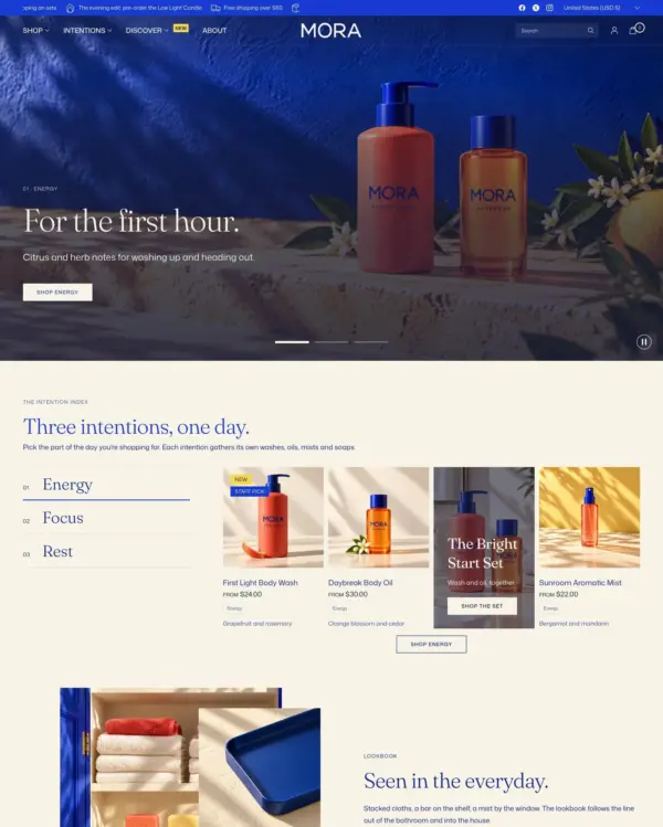
New Mora style preset for wellness stores, in cobalt and ivory with red and yellow accents. The intention-led homepage has a slideshow of its three intentions, a numbered collection index, a lookbook teaser, a routine bundle, an editorial ritual and the journal. It also has these templates:
- Products: a product page with set, object and feature layouts, plus quick view.
- Collections: a collection page with edits and objects layouts, plus the collections list.
- Pages: about, lookbook, contact, Our ritual, Help & FAQ, Stockists, Makers and a campaign page.
- Store pages: blog, article, cart, search, 404 and password.
- Groups: header, footer and pop-up.
Image slots are left for the merchant's photography.
Sections in the theme editor's Add section menu are now grouped into categories: Collections, Products, Blog, Media, Storytelling, Reviews, Forms, Promotions, Information and Layout. The section you need is quicker to find than in one long alphabetical list.
Apps that listen for Shopify's standard storefront events now receive them from the theme, such as analytics and pixel apps. The events cover:
- page, product, collection and cart views;
- variant changes;
- filtering on collection and search pages;
- cart changes, cart note changes and cart errors.
Corner radius setting (Theme settings → Corners). It rounds:
- images, product cards, collection and blog cards, and product media;
- before/after images and review photos;
- the Countdown banner, the Featured collection list and Interviews;
- sections with a background color.
It's 0 by default, so existing stores are unchanged. With a radius set:
- Blog post cards sit below their image instead of lifting over it.
- Product option buttons, the pickup availability box and the Interviews name badge take half the radius.
- Image hotspot pins become solid discs in the section's text color, and Shop the look pins take the text color.
- A Text with icons with a background color sits inside the page margins as a rounded tile.
Heading size setting (Theme settings → Typography → Section headings): Large, Medium or Small. It sets the heading above sections such as Featured collection, Blog posts and Customer reviews.
Background setting, with gradient support, on Featured collection, Collection list, Collection tabs, Multicolumn, Customer reviews, Blog posts and Before/after image. The color fills the section inside the page margins and lines up with the edges of banners and other colored blocks, so colored sections read as blocks on the page.
Animations theme settings, both off by default:
- Heading reveal: None, Fade up, Line by line, or Line by line, first section only.
- Animate section backgrounds: settles sections that have a background color into place as they scroll into view.
Both need Enable animations turned on. They follow the reduced-motion preference and never leave a heading hidden if scripts fail.
Blend photos into colored sections setting (Theme settings → Product card), off by default. Product photos shot on a white backdrop take the color of the section they sit on. This covers colored tiles, the Comparison table, review cards, Routine bundle steps and the Product slider. Colored packaging picks up a tint of it.
Balance padding in colored sections setting (Theme settings → Spacing), off by default. On desktop, colored tiles, the Newsletter band and a colored Text with icons get 50px above and below their content, matching the space at their sides.
Badges per card setting (Theme settings → Product card → Custom badges): show every custom badge, or only the first 1 to 3 in group order. Sold out, sale and pre-order badges always show. Featured collection can also Hide custom badges.
New Comparison table section: up to four products side by side.
- Rows can show product metafields (lists are joined), a tag as a check mark, a rating, the product type or the vendor.
- Each product has an add to cart or quick view button under it.
- On product pages it can start with the product being viewed and take its other columns from a product list metafield, so every product is compared with its own set.
New Routine bundle section: shoppers pick one product for each step, see the running total and add the whole routine to the cart at once.
- Up to six steps, with up to four choices each and shade dots for color options.
- Steps can be optional and carry their own background color.
New Editorial ritual section: up to six numbered steps, each with an image, heading, description and optional link, with background, text and accent colors. Enable swipe on mobile (off by default) puts the steps in one row on phones that scrolls sideways, with the next step peeking in, instead of stacking them.
Collection banner additions:
- Background and Text colors turn the banner into a tile with the collection image filling its side. On a tile:
- the Read more link takes the tile's text color;
- the text switches to a readable color when a collection's own color doesn't contrast with it (see Collection color metafield under Changed).
- Subcollection links can show as pills.
- Show collection image on mobile (on by default): turned off, phones show the banner without the image and don't download it.
- Background and Text colors turn the banner into a tile with the collection image filling its side. On a tile:
Collection tabs layout setting: Numbered index lists the collections as a numbered column beside their products. The numbers, dividers and an index label per collection (in place of its title) are optional.
Text size setting for the mobile menu (Header → Mobile menu). Regular, the default, is unchanged. Large:
- sets the main menu items as display type that scales with the screen and with the navigation Font size scale (Theme settings → Typography);
- makes the sub-menu items and the secondary menu larger;
- keeps menu badges centered on their item.
Promotional banner button background and button text colors. Heading level setting (H1 to H3) on Promotional banner and Rich text headings, so the page's main heading can be set where it sits.
Section width on the Newsletter section: Grid, Full width, or Full width, no spacing. Full width, no spacing is the default and keeps the previous edge-to-edge band.
Number of columns on mobile on Multicolumn and Customer reviews.
In the theme editor, Multicolumn columns without an image show a placeholder image, so the layout is visible before images are added. The storefront still shows those columns as text only.
An optional heading, subheading and description on Shop the look, and above the image on Image hotspots.
Countdown banner layout setting: Stacked centers the heading, timer and link, in that order.
Timeline layout setting: Side by side shows every entry at once in equal columns from tablets up, each photo in a 4:3 frame above its text. Phones keep the swipe. Scroll, the default, is unchanged.
Interviews question font setting: the body font (the default) or the heading font.
Overlay and Overlay opacity settings on promotion tiles in the Product grid, Collection tabs and Featured collection, so text stays readable over a photo. The opacity is 0% by default, so existing tiles are unchanged.
Changed
- Important: Collection banners take their background from a collection color metafield. The Collection color metafield setting in the Collection banner section is
custom.colorby default.- Collections that already store a color in that metafield show their banner as a color tile, with the collection image filling its side.
- To keep the previous banner, clear Collection color metafield.
- Important: Some sections' spacing changes. Check pages that use these sections after updating.
- Shop the look now applies its section spacing.
- Featured product uses the section spacing instead of a fixed 40px.
- A Rich text that keeps its bottom spacing no longer adds 35px under its last text block.
- The collection SEO text, the blog's last row and the last FAQ row no longer add space below them.
- Article page: the Show excerpt and Show sharing buttons settings in the Title block now work.
- In 7.0.0 they were on by default but did nothing. Article templates saved with them on now show the article's excerpt and sharing buttons under the title.
- To keep the previous look, turn them off in the Title block.
- Sharing under the title steps aside when the page has a Sharing block.
- Rich text with a background color frames its content evenly. The space beside the text now matches the section spacing above and below it: up to 80px on desktop and 30px on phones, instead of a fixed 20px.
- Headings balance their lines, so a heading no longer ends on a single word.
- Article text keeps to about 70 characters a line.
- On phones, Promotional banner buttons span the full width of the banner.
- Newsletter email fields in the Newsletter section, footer, pop-up and password page follow the button Border radius (Theme settings → Buttons), so they match the button beside them.
- Slideshow, Testimonials and Image with text slideshow show a pause button while they autoplay.
- They start paused for visitors who prefer reduced motion.
- They hold the current slide while keyboard focus is inside them.
- Pausing also pauses a slide's background video.
- The language and country selectors only appear when the store has more than one language or country, instead of a single-option list. The mobile menu no longer shows an empty strip in their place.
- Countdown timers stop at zero instead of showing zeros.
- A Countdown banner then hides completely, heading and button included.
- A Countdown banner whose date has already passed doesn't appear at all.
- In the pop-up, only the timer hides.
- The theme editor keeps both visible, so they can still be edited.
- Sections no longer show the theme editor's placeholder copy (such as "Add a tagline" or "Describe your featured collection here") on the storefront when a template leaves those settings empty. For example, the product recommendations on the cart page showed it. Sections added in the theme editor still start with it as a prompt.
Other fixes and improvements
- Fixed variant option cross-outs (the unavailable state on swatches, buttons and dropdown options) not updating when the selected combination has no matching variant. Cross-outs stayed frozen on the previous option's availability. This also fixes the sticky add-to-cart selector, which lagged one change behind.
- Fixed quantity changes and removals on the cart page and in the cart drawer sometimes affecting the wrong product. This happened when an app or script added or removed a line in the background, such as an automatically added free gift. Two cart lines of the same variant with different custom options, such as engraving text, also stay apart.
- Accessibility across the theme, to WCAG 2.2 AA:
- Screen reader names:
- These controls now have names that screen readers announce: the mobile menu button, cart link, cart remove buttons, quantity buttons, slider arrows, product media gallery and the Before/after image slider.
- Collection tabs announce which tab is selected.
- Background video's play and pause buttons are labeled.
- Hard-coded English labels are now translated.
- Keyboard access:
- Close buttons on drawers and panels, and Back to top, can be reached and used with the keyboard.
- Back to top appears when focused and moves focus back to the page content.
- Product card image arrows appear on keyboard focus, and the quantity field shows a focus outline.
- Touch targets: remove buttons, small quantity buttons and the newsletter button meet the minimum size, and mobile secondary menu links are taller.
- Image hotspots: the pins are now buttons. They can be reached and opened with the keyboard, and announce whether their note is open.
- Featured collection list: collection names are no longer repeated three times to screen readers and keyboard users.
- Headings:
- Each page has one main heading. The Featured product and quick view titles no longer compete with the page heading, and the cart, collections list and account pages now have one.
- Headings follow the page outline. Background video's heading is the page's main heading when it opens the page, and the Page section's title is a main heading only when it comes first.
- Text with icons titles, Before/after image headings and the Featured product card heading no longer skip levels.
- Heading sizes are unchanged.
- Forms:
- Price filter fields have labels.
- Email fields no longer reject valid addresses with a plus sign or a longer domain ending.
- Each newsletter consent checkbox has its own label.
- Contrast:
- The skip to content link uses the theme colors.
- Form labels, subheadings, the footer copyright and error messages are darker.
- Badges and the cart count are slightly larger.
- The role line in the Interviews name badge is at 70% opacity instead of 40%.
- Inactive Collection tabs reach 4.5:1 contrast.
- Motion: when the visitor prefers reduced motion, these stop moving and show their content once:
- Scrolling text, Image with scrolling text, Scrolling images and the Featured collection list;
- the announcement bar and cart drawer promotion marquees;
- pulsing hotspots and map pins.
- Duplicate copies and new tabs: marquee copies are no longer read out or tabbed through several times, and only links to other sites open in a new tab.
- Screen reader names:
- Faster first image: the first image on the page starts loading right away, so it appears sooner. This covers the first slide, a Promotional banner in the first section, product media and collection banners. A first-section Promotional banner with a mobile image downloads only the image for the visitor's screen.
- Sharper, lighter images:
- Blog post cards (Blog posts section, blog page, search) offer larger image sizes, so their images stay sharp on high-density screens.
- Promotional banner images are offered at their full width again, so landscape photos stay sharp on large screens. They were capped at the photo's height in pixels.
- Slideshow slides without a mobile image now offer a range of image sizes, so phones no longer download the full-size photo.
- A slide that follows one with a mobile image no longer borrows that image's sizes, which could leave it blurry on desktop.
- Product card videos now play on phones and in browsers that block autoplay with sound (they stayed on their first frame). They hold still for visitors who prefer reduced motion.
- Product card image arrows sit on the correct sides and point the right way in right-to-left languages.
- Fixed product pages and Featured product scrolling sideways on phones when the product information held a full-width slider such as Complementary products.
- Fixed the bottom of the mobile menu, where the country and language selectors sit, ending below the screen while an announcement bar shows. The menu now fills the screen from wherever the header sits.
- Fixed the Multicolumn "Circle" image ratio rendering as a square: the option had no styles, so it did nothing.
- Fixed blog post cards (Blog posts section, blog page) painting their date and title behind the bottom of the post image. The overlapping card now sits above the image as designed.
- Fixed a tall blank gap above the footer on collection and search pages whose products fit in a row or two. The desktop filter sidebar now only takes the height of its filters, and still stays in view while you scroll long collections.
- Fixed color swatches in collection and search filters going blank for values grouped in the Search & Discovery app (for example Petal and Petal Pink grouped as Petal). A grouped value now takes the color listed for the group's name.
- Fixed Timeline cards on phones: an entry with less text than its neighbors ended its colored box early, leaving a gap and square corners at the foot of the card.
- A Featured collection list set to scroll Right now moves on every page. Without an announcement bar or another scrolling section on the page, it stood still.
- Menus:
- A menu item with a mega menu but no child links and no promotion image now shows as a plain link instead of opening an empty panel.
- In menus made only of mega menus, the page now dims behind an open mega menu. Before, the page overlay only turned on when the menu also had a plain dropdown.
- A transparent header stays solid while the mobile menu is open. Opened from the keyboard, the menu used to show white text on its light background.
- Menu badges without text don't render.
- A mega menu promotion without a link no longer links to the current page.
- Footer text buttons without a link don't render; they used to link to the current page.
- Errors:
- Fixed carousels with a single slide (for example Collection tabs or Recently viewed products with one product) throwing errors on load and on resize.
- Fixed "Load more" and infinite scroll stopping with an error when animations are off, on stores without the Stamped reviews app.
- Fixed a hidden Liquid error in the Promotional banner's markup on banners without a mobile image or with an image height other than Adapt.
- Fixed selecting a Featured collection list block in the theme editor throwing an error.
- Cart and store pages:
- Fixed the cart terms checkbox linking to an empty address instead of the chosen terms page.
- Dropdown fields in the Contact form show their arrow. Before, they looked like plain text fields.
- The blog page no longer outputs an empty description area.
- The page not found message now reads "doesn't".
- Map:
- The location list works without a Google Maps key, and the fallback image shows.
- Pins with missing or malformed coordinates are skipped instead of breaking the map.
- Clicking a pin opens its location.
- The location buttons announce which one is selected.
- Collection banner: subcollection links keep the menu's own titles and any filter in their address.
- Product page:
- The Flash message block shows its message even without a heading.
- The Fit guide block hides when its value is empty or not a number.
- The need-help pop-up has a proper name for screen readers.
- Siblings:
- The block falls back to the product's sibling metafields when it has no collection.
- It no longer shows a swatch's hex code or image file name as the color name, or adds it to the cart line.
- Sizing guide:
- Fixed the sizing guide link showing twice when its option is shown as color swatches.
- Quick view no longer shows an empty "Size guide" button.
- Fixed the low stock icon losing its color.
- The quantity box beside Add to cart follows the button Border radius (Theme settings → Buttons) instead of staying square.
- Product pages load a little faster: their styles no longer download twice.
- Section images and overlays:
- Interviews and Product slider now show their mobile image on phones.
- Revealed media with text shows a hosted video without also needing an image.
- The Featured product card's overlay color setting now applies.
- Image with scrolling text and Image with text overlay now apply their overlay color setting.
- Countdown banner and pop-up countdown: the Minute list now offers 22 and 23. The option labeled 23 used to set minute 22, and minute 23 couldn't be chosen.
- Tabbed content:
- Center and right tab alignment now work.
- Links inside tabs look like links.
- The icon gap follows right-to-left layouts.
- Progress bars show the right length when animations are off or the visitor prefers reduced motion (an 80 showed as 20).
- Buttons:
- Outline buttons in a Promotional banner take the banner's Text color.
- Promotional banner buttons keep a gap between them, as does a Rich text button followed by a text link or a second button.
- Buttons in narrow product grid promotions stay on one line on phones.
- Colors and icons:
- Announcement bar icons take the bar's text color (they were always black) and have room before their text.
- A colored Timeline's subheading and description follow its text color.
- Blog layout:
- Blog pages with 3, 4, 6 or 7 posts lay out in full rows instead of leaving a gap on the last row.
- The blog tag bar keeps the section spacing below it.
- Featured blog leaves out the article being read.
- Product specifications:
- Fixed a trailing comma after the last value of list metafields in the specification table.
- Fixed empty icon slots on Collapsible content specification rows.
- Fixed the star rating next to a product card title breaking its number across lines in narrow columns.
New locales, accessibility improvements, animated grid transitions, and fixes for variant images and collection tabs.
Added
- Korean (ko), European Portuguese (pt-PT), and Polish (pl) locales.
Changed
- Filtering, sorting, and "Load more" pagination now animate the product grid between states using the View Transitions API in supported browsers (progressive enhancement — other browsers keep the instant swap). Respects the theme animations setting and
prefers-reduced-motion. - Non-English color option names listed in the "Additional swatch variant options" theme setting now render colored active-facet pills, matching the other swatch locations. The setting also now respects the mobile "show color swatches in filters" toggle, matching the built-in language list's behavior.
Accessibility
- Keyboard focus is now trapped inside open side panels (cart drawer, product drawer, facet drawer, product info side panels, quick-view, mobile mega menu sidebar). Tab and Shift+Tab wrap within the panel, closing the panel restores focus to the trigger, and stacked panels follow the topmost overlay.
- The theme now honors OS-level
prefers-reduced-motionat page load. Visitors with reduced motion enabled see no theme animations; merchants who have already disabled animations in theme settings are unaffected.
Other fixes and improvements
- Fixed variant image set matching for non-ASCII variant values. Variants whose option value contains characters outside [a-z0-9] (Turkish ı/ş/ç/ğ, Polish ł, German ß, Icelandic þ/ð, etc.) previously failed to switch the gallery to the correct image group, leaving only the first image visible. Both ends of the comparison now flow through Shopify's locale-aware
handleizefilter so any language Shopify supports is matched correctly. - Fixed the Collection tabs section's "Shop {collection}" button not switching when a different tab is selected — the first collection's button was shown regardless of the active tab.
- Centralized the "is this a color option?" check into a single snippet so behavior stays consistent across product cards, variant pickers, filters, and active-facet pills.
- Modernized the SCSS build (migrated from node-sass to Dart Sass); compiled CSS output refreshed across all section stylesheets.
Combined listings support, lightbox enhancements, mobile menu navigation option, bug fixes, and slim variant options on product cards.
Added
- Combined listings support: child products linked via a shared option (e.g., Color) now swap seamlessly using the Section Rendering API instead of a full page reload. Hovering over combined listing options prefetches the child product HTML for instant switching.
- PhotoSwipe lightbox now shows a scrollable thumbnail strip and product title/variant name in a bottom bar, with section settings to toggle each feature. Navigating the lightbox syncs the product page slideshow, and variant changes update the lightbox variant title.
- New "Parent links open their own URL" header setting for mobile menu. When enabled, tapping the link text navigates to the URL while only the arrow opens the sub-menu. Applies to all nesting levels.
Changed
- Use slim variant options on product cards
Other fixes and improvements
- Important: Fixed pickup availability showing stale location data when switching between product variants. Availability now updates only after fresh section HTML is rendered, and server-side Liquid content is replaced with a template fallback to prevent outdated data from flashing.
- Fixed variant dropdowns not working
- Minor JS cleanup
- Config fix
Major performance release with 2048 variant support, Shopify account menu integration, and widespread JS optimizations across core sections.
New Features
- 2048 variants support — product pages and variant selectors now handle catalogs with up to 2048 variants
- Shopify account menu — integrated native Shopify customer account menu
- Countdown banner animation — animated countdown timer in the banner section
Performance Improvements
- Converted cart to a custom element; eliminated double-trigger on item remove events
- Optimized Collection Tabs JS — reduced unnecessary reflows and re-renders
- Optimized Header JS — deferred non-critical initialization
- Improved app.js initialization performance
- Improved Back to Top JS performance
- Improved Slideshow JS performance
- Improved Image with Text Overlay JS performance
- Improved Sticky Scroller performance
- Decreased forced reflow across layout calculations
- Improved max-height sections CLS (Cumulative Layout Shift)
Bug Fixes
- Fixed "Use the first product image as the collection image" setting not working correctly in the Collection List section — the setting was computed but never applied to the rendered image
- Fixed Featured Collection List section images not displaying correctly
- Fixed pagination loading issue
Improvements
- Improved HTML semantics across multiple sections
- Removed unused code
Fixes collection card image issue introduced on last update
Fixes and other improvements
- Fixes minor issue with collection card
What merchants say about Ascension Shopify theme
Merchant sentiment summary
AI17 of 18 reviews are positive, with 1 negative. Merchants most often praise the responsive, knowledgeable support team, the ease of customisation, and the regular updates and range of features. The single negative review describes slow support replies and filter bugs, which is an isolated complaint rather than a recurring pattern.
Generated from all 18 Theme Store reviews ·
Ascension has received 4 reviews in the last 12 months.